Case study · No. 04 · Travel · booking · 2024
MECCA Booking: booking near the Haram without guessing the distance
A rental platform for Umrah and Hajj: verified homes within walking distance of the Haram, a three-step booking for pilgrims, and a space for the hosts who welcome them.
- Web UX/UI
- Back-office
- Design system

- Role
- Product designer, from research to prototype
- Duration
- 10 weeks
- Team
- Concept project, solo
- Platform
- Web, desktop first
- Tools
 Figma
 Miro
 Google Meet
 Google Docs
- Deliverables
- Benchmark, Proto-personas, Journey map, User flows, Wireframes, Design system, 28 screens, Prototype
The project in numbers
What was delivered, counted in the Figma file. The product is fictional: no usage results.
28
screens
17 for the traveller, 11 for the host and the moderation team
3
roles served
The pilgrim, the host, the team that checks listings
23
components
On three variable collections: colours, spacing, radii
01 · The project
Staying near the Haram
Every year millions of pilgrims look for a place to stay in Mecca for Umrah or Hajj. In 2024 Saudi Arabia counted 35.7 million Umrah pilgrims, 16.8 million of them from abroad.
For them the criterion is neither style nor price alone: it is the walking distance to the Haram, an arrival possible at any hour after a night flight, and a host they can trust, often with a whole family.
MECCA Booking is a rental platform designed for that stay: search by distance to the Haram, book in three steps, and, for hosts, run listings, calendar and earnings.
Ten weeks, from research to back-office
01 · Weeks 1–3
Discover
The booking journeys of four offers, from generalists to agency packages, and the context of the pilgrimage.
- Benchmark
- Desk research
02 · Weeks 3–4
Define
Two proto-personas, traveller and host, and the experience map of a stay.
- Proto-personas
- Journey map
- HMW
03 · Weeks 4–6
Ideate
Architecture of both spaces, booking flow, wireframes.
- User flow
- Impact × effort
- Wireframes
04 · Weeks 6–9
Prototype
Design system, 17 traveller screens, 11 host and moderation screens, a linked prototype.
- Design system
- High-fidelity UI
- Figma prototype
05 · Weeks 9–10
Check
A review against UX laws, empty and error states, a test plan.
- Heuristic review
- Test plan
02 · Discovery
A market of pilgrims, not tourists
13.7 M
Umrahs performed in Mecca
73 % of the total, the rest in Medina and elsewhere.
≈ 1 km
on foot, at most, with elders
The distance to the Haram a family accepts, five prayers a day.
Hypothesis
3 to 6
travellers per booking
Parents, spouses, children: people book for a family.
Hypothesis
2 am – 4 am
common arrival times
Night flights land when nobody opens the door.
Hypothesis
Attendance figures read in October 2026. The others are hypotheses to check in interviews.
Four ways to find a bed
The generalists, home sharing and the indirect alternative: the agency package.
| Criterion | MECCA · the projectThe project | Booking.comGeneralist | AirbnbHome sharing | Agency packageIndirect |
|---|---|---|---|---|
| Walking distance to the Haram | YesOn every listing, and as a filter | PartlyDistance to a landmark | PartlyA map, not a distance | NoHotel imposed |
| Self check-in at any hour | YesCode sent the day before | PartlyDepends on the place | Yes | PartlyGroup welcome |
| Clear cancellation before paying | YesDate and amount | Yes | Yes | Not documented |
| Content made for Umrah | YesDistricts, gates, suhoor | No | No | YesGuidance |
| Free choice of dates and home | Yes | Yes | Yes | NoThe group's dates |
The table scrolls sideways.
A review of public journeys, without an account. Verdicts describe what was visible, not a full audit.
Takeaway
Generalists know booking, not pilgrimage; agencies know pilgrimage but impose everything. The open space: the freedom of a rental, with an agency's knowledge.
03 · Definition
Two sides of the same door
Proto-personas: hypotheses to validate in interviews; their quotes are illustrative.
P1 · the pilgrim
Youssef, 46
Manager in Casablanca, going on Umrah in April with his mother and wife
- Goal
- An apartment under ten minutes' walk from the Haram, booked before the flights
- What gets in the way
- Listings “near the Haram” without a distance, arriving at night after the flight
« My mother walks slowly: I want minutes, not “close”. »
P2 · the host
Youness, 38
Has rented three apartments in Ajyad to pilgrims for years
- Goal
- Fill Ramadan and Hajj without spending his nights on the phone
- What gets in the way
- Requests on WhatsApp, cash at key handover, late cancellations
« I want to see this week's arrivals without opening ten chats. »
Youssef's stay, before
Without a dedicated platform, between a generalist site and messages. Emotions assumed.
Youssef
01Search
02Compare
03Book
04Arrive
05Stay
06Return
Does
Thinks
Feels
Opportunity
The map scrolls sideways.
The problem to solve
Pilgrims need to know the walking distance to the Haram and the hour they will be able to get in, because they travel as a family and pray five times a day. Today, listings say “close” without proving it.
The questions the design answers
Q1
How might we make walking distance the first search criterion?
Why this one · It is the one criterion you cannot fix once there.
Q2
How might we make arriving possible at any hour?
Why this one · The peak of anxiety on the experience map.
Q3
How might we make a host trustworthy before payment?
Why this one · You hand your family to a stranger.
Q4
How might we help hosts fill their dates without chats?
Why this one · Youness does everything by hand.
04 · Ideation
What the first version keeps
Impact ↑
Quick wins · Impact high · Effort low
Walking distance to the HaramIn V1
Q1
Dated cancellation, total priceIn V1
Self check-in and codeIn V1
Q2
Big bets · Impact high · Effort high
Listings checked by the teamIn V1
Q3, moderation console
Host space: calendar and pricesIn V1
Q4
Host–guest messagingIn V1
Nice to have · Impact low · Effort low
Prayer times on the listingLater
Later · Impact low · Effort high
Disputes and refundsIn V1
Needed to take payments online
Mobile appLater
The stay is planned on a computer
Effort →
Impact and effort estimated: a designer's ranking, to review with a team.
Booking, in three steps
Start
Home
Destination, dates, guests
Screen
Results
List and map, distance to the Haram
Screen
Listing
Photos, amenities, reviews, total price
Decision
Signed in?
No: sign in or create an account, then back to the listing
Screen
Your stay
Guests, arrival time
Screen
Payment
Card, PayPal or Apple Pay
System
3-D Secure check
End
Confirmation
Arrival code sent the day before
Low-fidelity wireframes
Four pages before any colour: the search, the results, the listing and the host dashboard.
01 · Home
02 · Results
03 · Listing
04 · Host dashboard
05 · Design
A warm, quiet design system
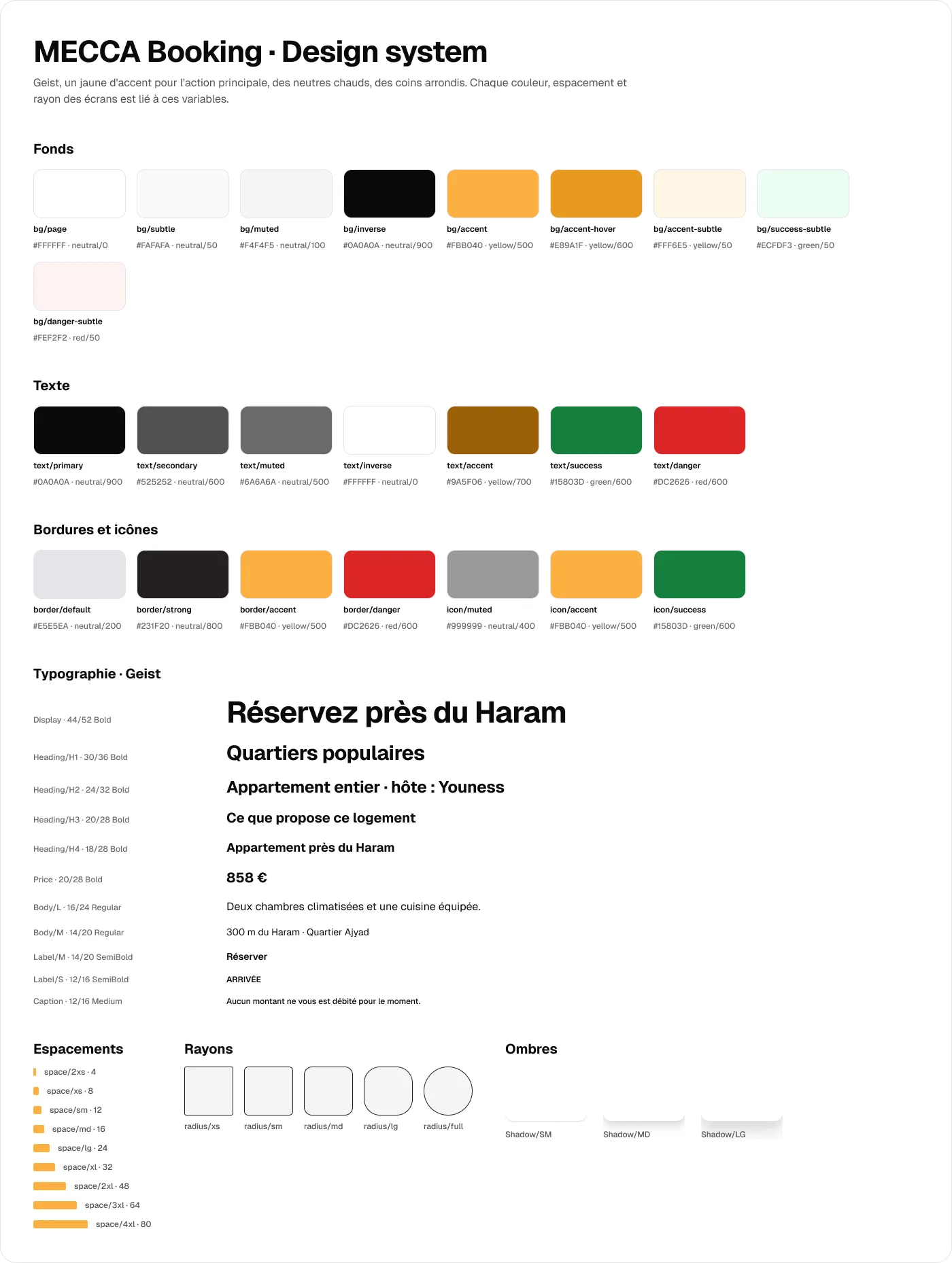
Geist, a yellow accent for action, warm neutrals and rounded corners: every colour, spacing and radius on screen is a variable.
Colours
Accent
#FBB040
Main action
Accent hover
#E89A1F
Hover state
Accent subtle
#FFF6E5
Banners, requests
Accent text
#9A5F06
Readable yellow text (AA)
Page
#FFFFFF
Background
Text
#0A0A0A
Headings and text
Secondary text
#525252
Captions
Success
#15803D
Confirmed, paid
Success subtle
#ECFDF3
Status fill
Danger
#DC2626
Cancellation, dispute
Type
Display
Geist Bold 44
Book near the Haram
Heading 1
Geist Bold 30
Popular districts
Heading 3
Geist Bold 20
What this place offers
Body
Geist Regular 16
Two air-conditioned bedrooms and a full kitchen.
Price
Geist Bold 20
€858
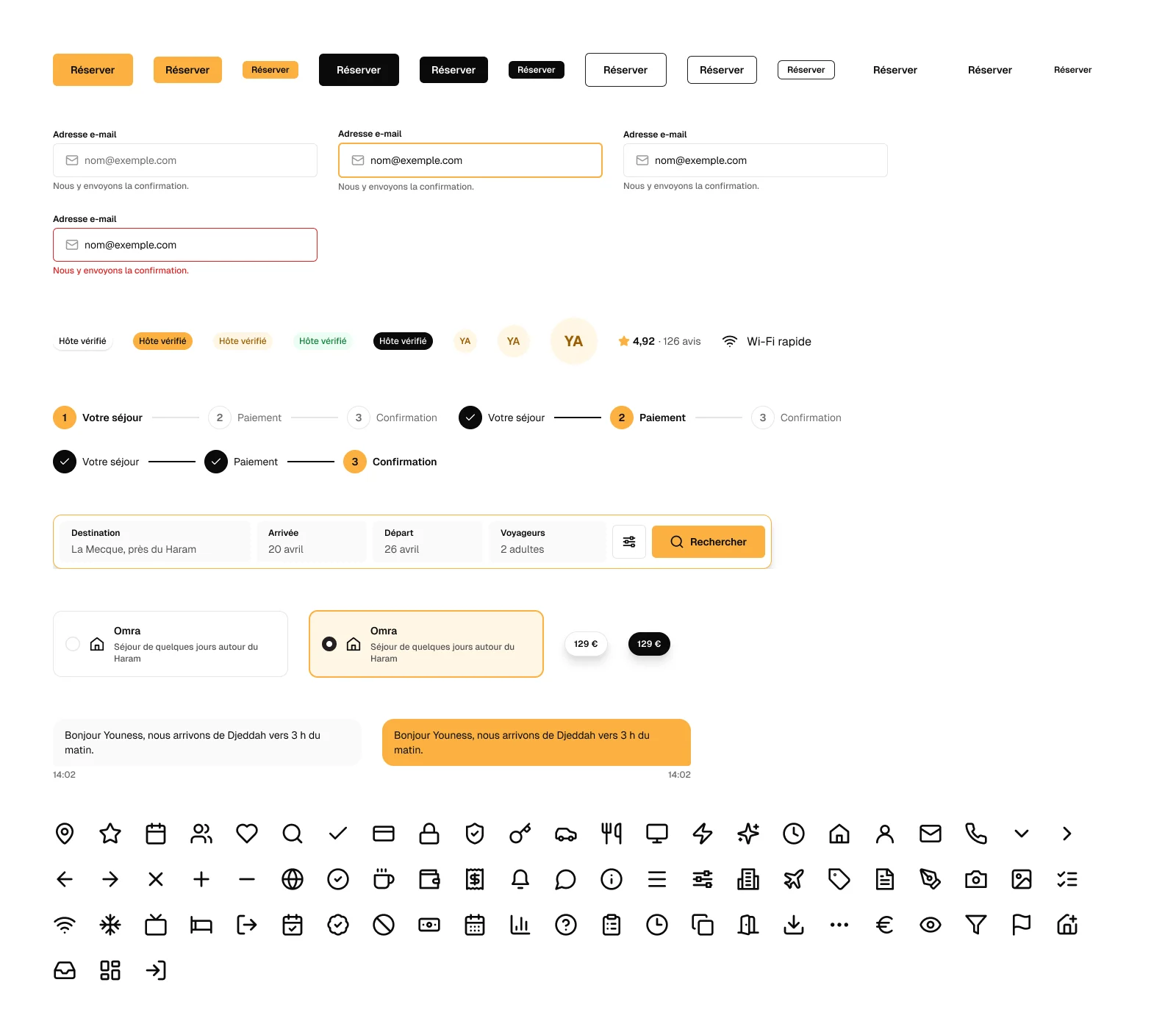
23 components
- Logo
- Button
- Badge
- Input
- Header
- Footer
- Search
- Stepper
- Amenity
- Rating
- Listing card
- District card
- Host card
- Review
- Price summary
- Option
- Booking row
- Avatar
- Price pin
- Message bubble
- Stat
- Host menu
- Host bar
Home: four fields, three guarantees
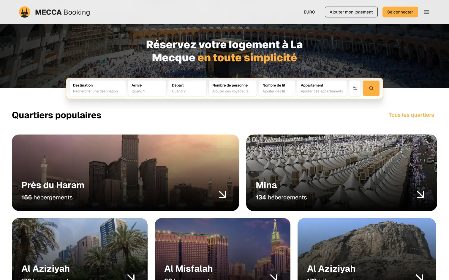
First iteration
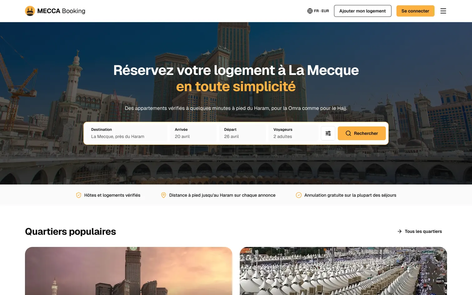
Final version
What changes
Search goes from six fields to four: destination, dates, guests, then the call to action.
UX law · Hick’s LawKept
Three guarantees under the search: verified hosts, distance to the Haram, free cancellation.
UX law · Serial Position EffectKept
One yellow button on screen: the one that runs the search.
UX law · Von Restorff EffectKept
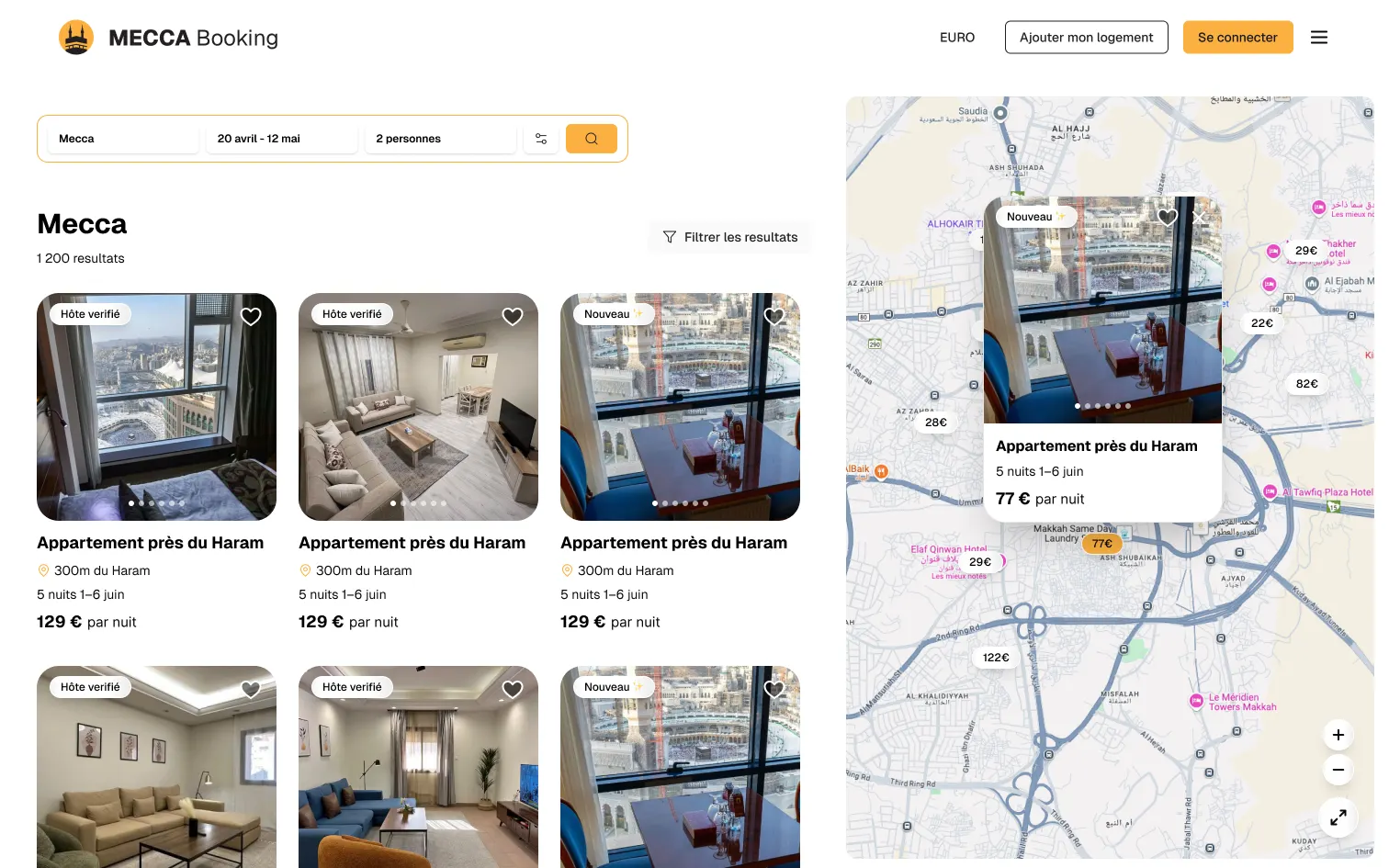
The listing: decide without scrolling
First iteration
Final version
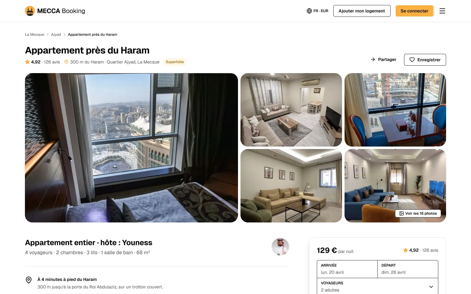
What changes
Title, rating, reviews and distance to the Haram fit on one line above the photos.
UX law · Law of ProximityKept
The whole stay's price and the cancellation stay on the right while reading.
UX law · Anchoring EffectKept
The traveller's journey
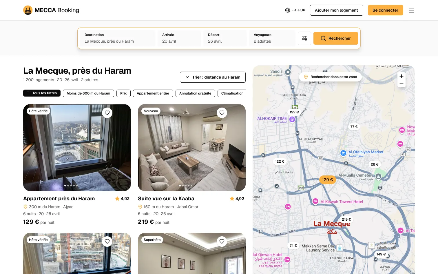
Results: distance first
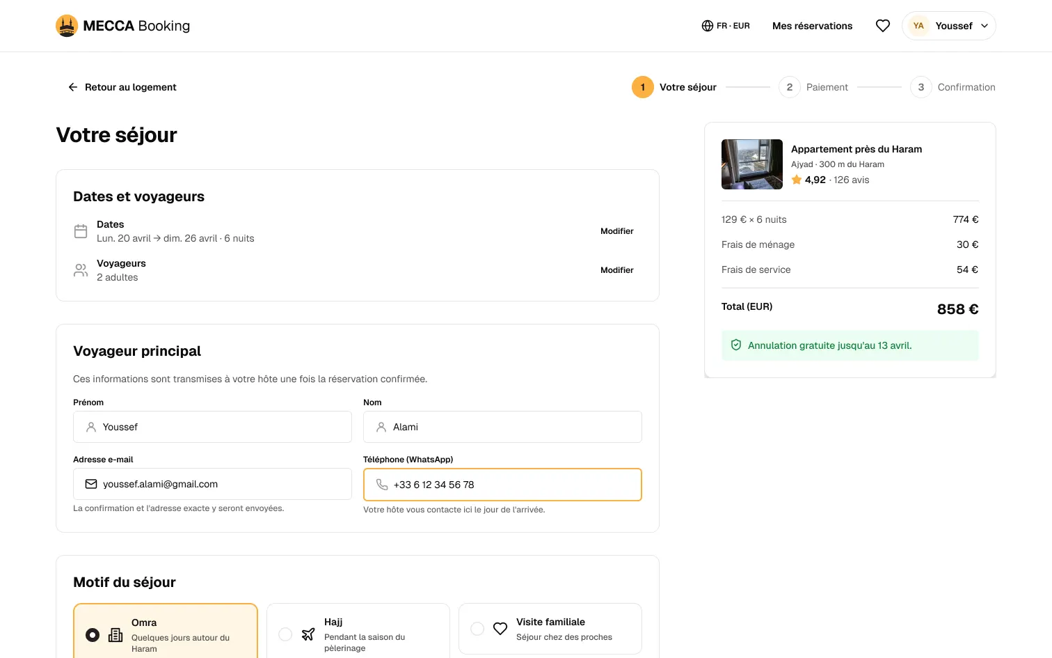
Your stay
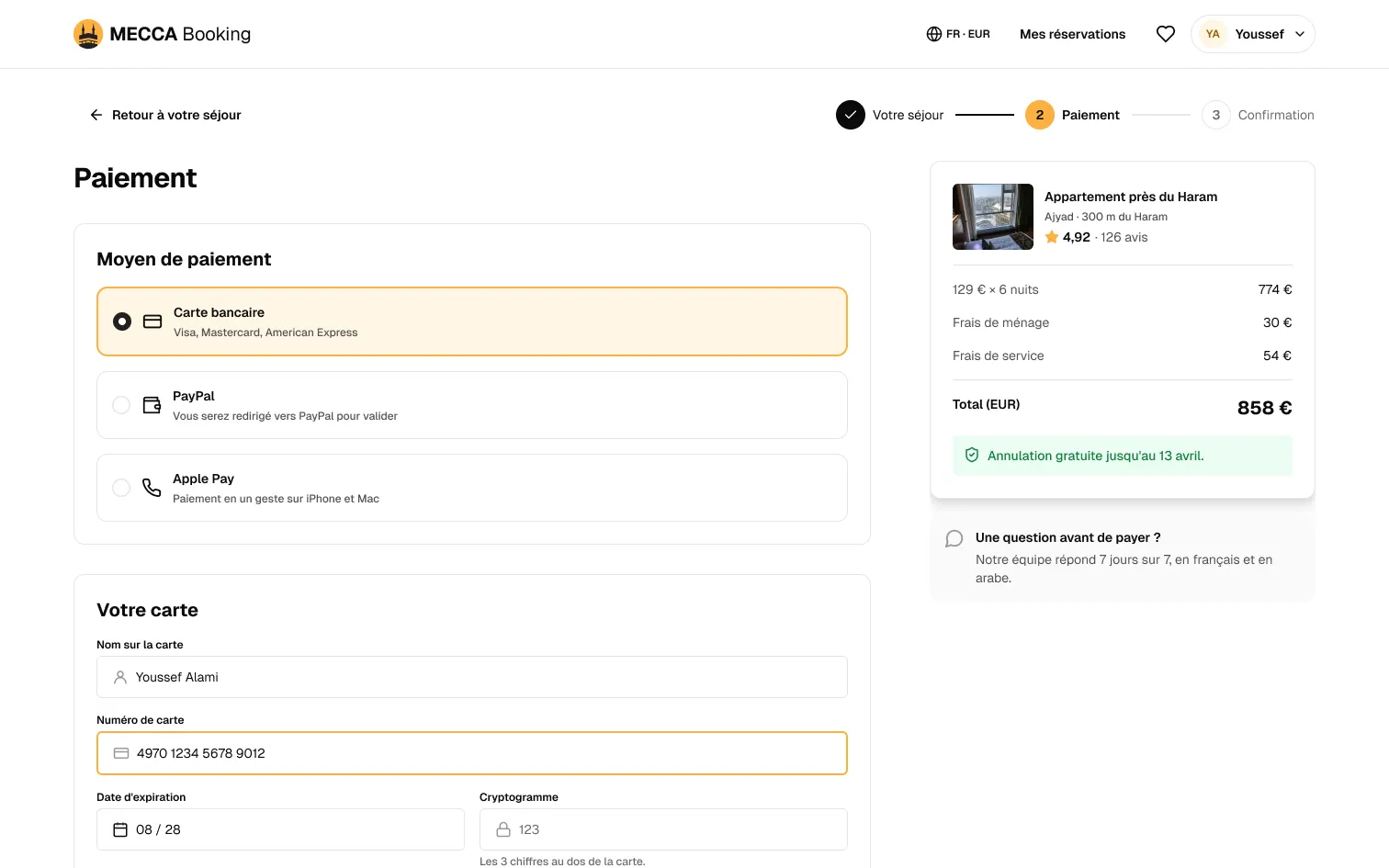
Payment
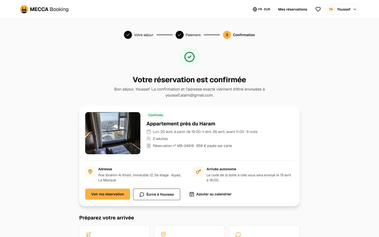
Confirmation
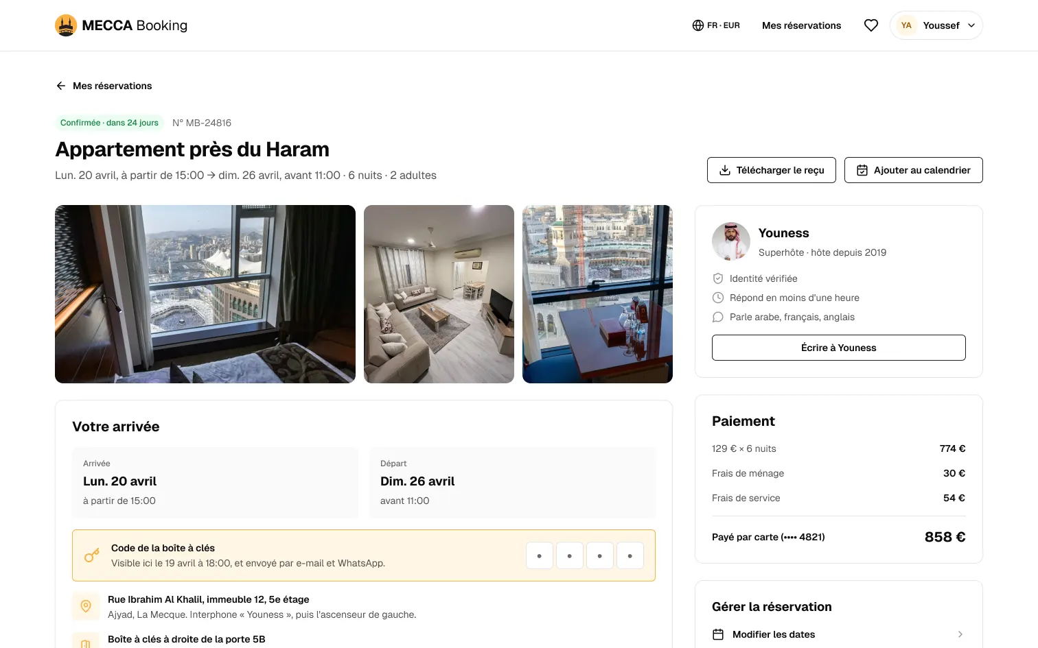
Booking details
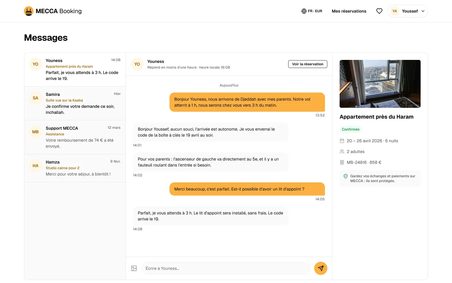
Messages
Host and moderation side
The back-office answers Q4: see the week, set prices, get paid, without chats.
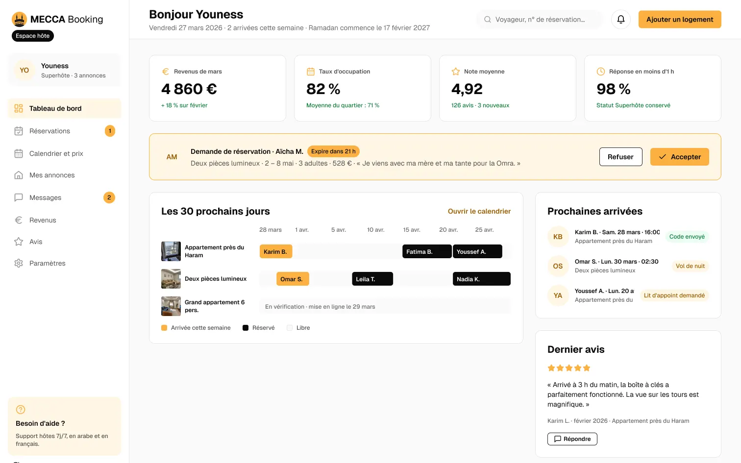
Dashboard
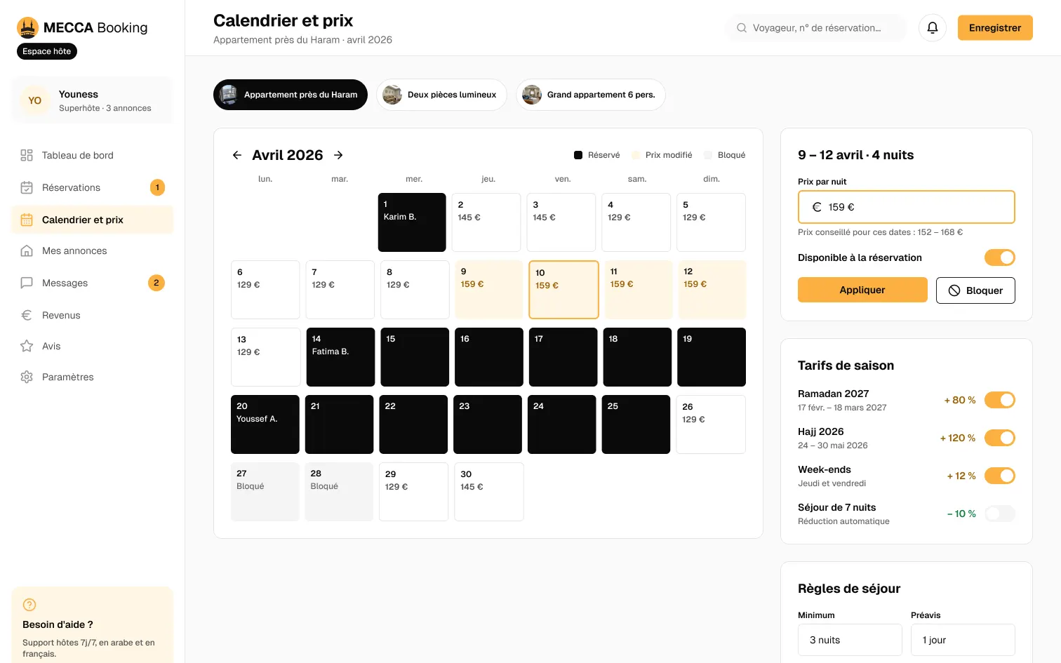
Calendar and prices
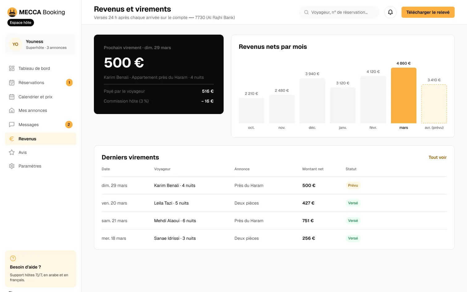
Earnings
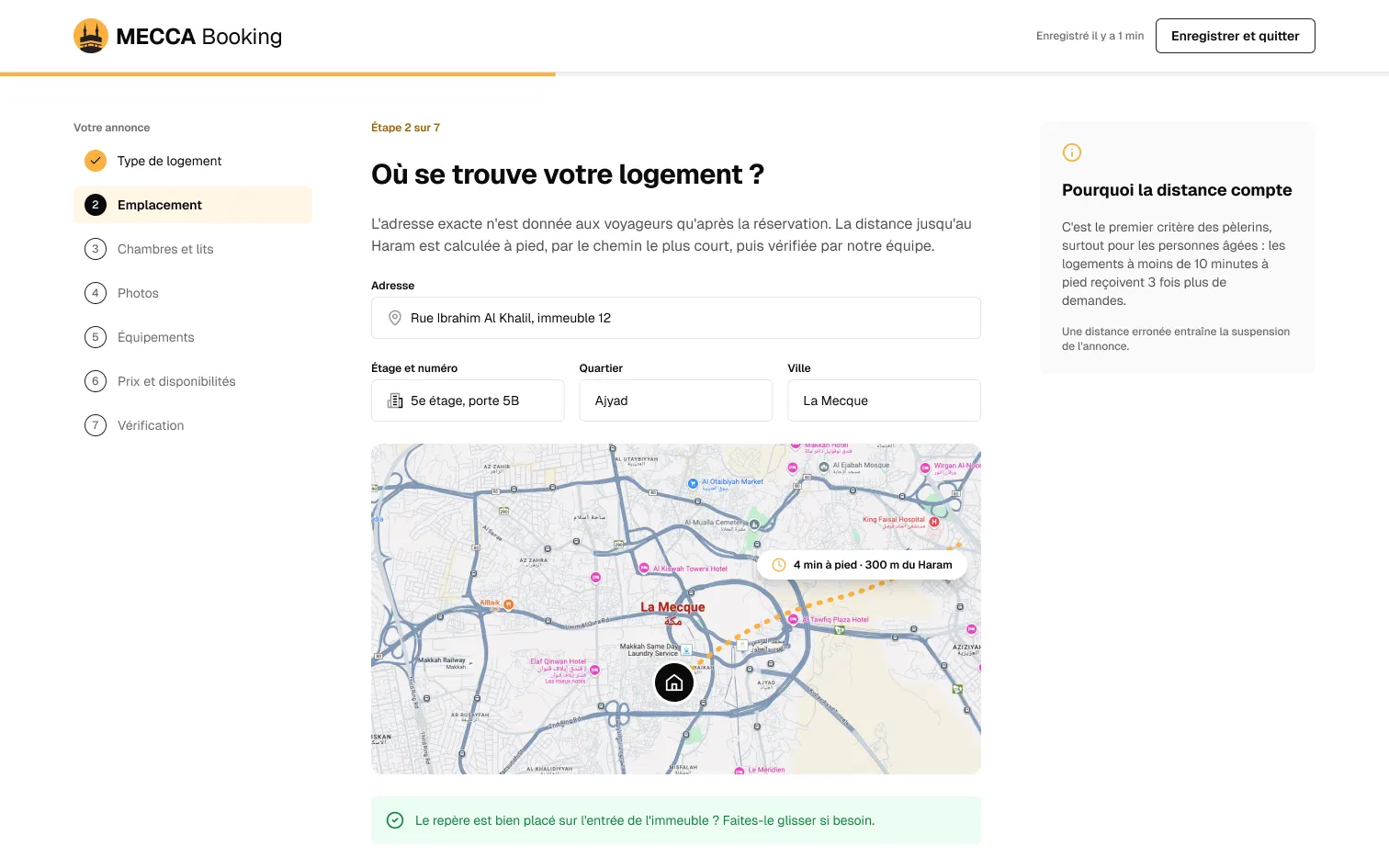
Add a home
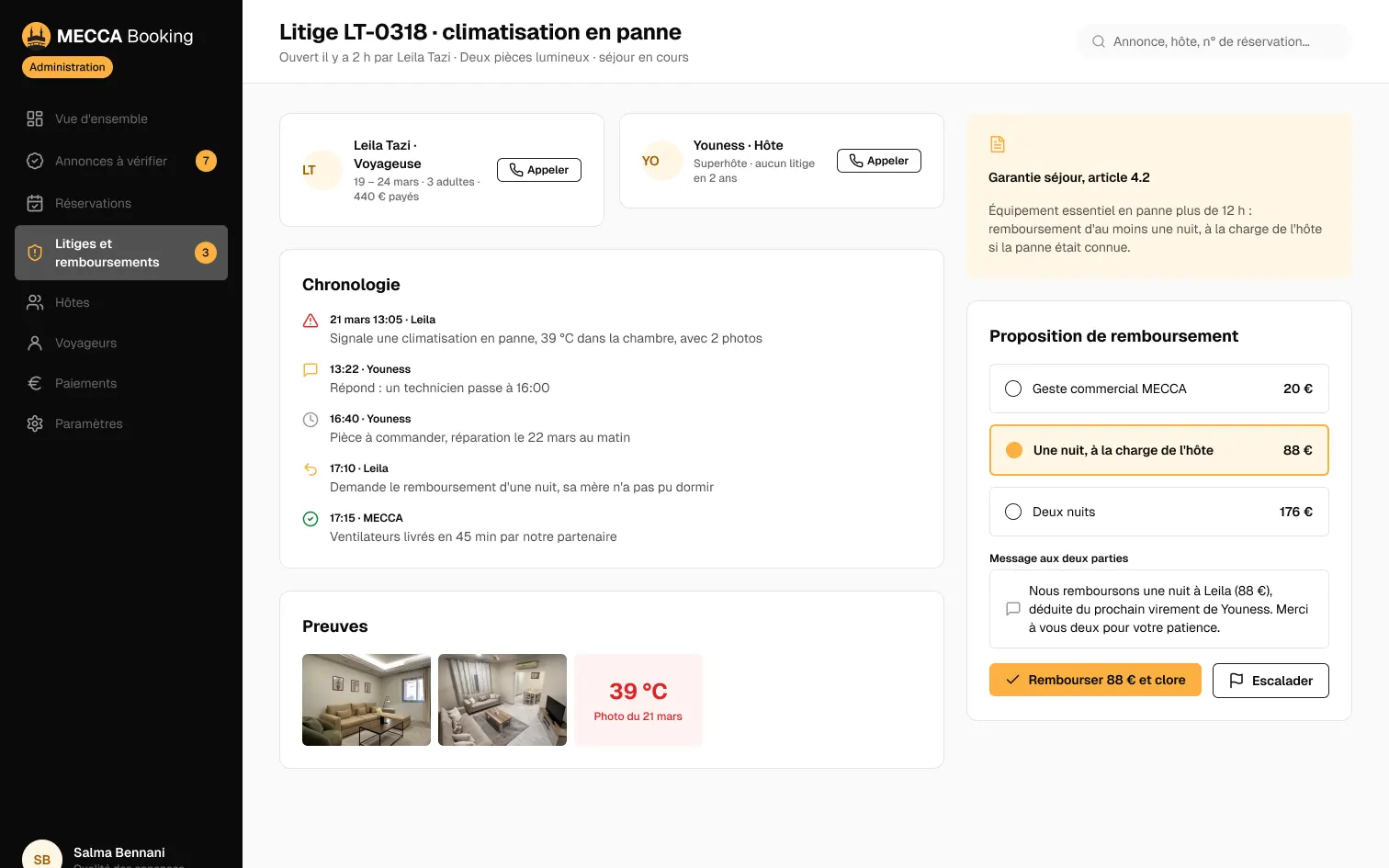
Disputes, team side
06 · Validation
UX laws at work
- Broken
Hick’s Law
More choices, slower decisions: cut and group the options.
Six fields before the first answer.
Home, first iteration
- Kept
Hick’s Law
More choices, slower decisions: cut and group the options.
Four fields, sensible defaults.
Home
- Kept
Von Restorff Effect
The one thing that differs is the one thing remembered.
Yellow is kept for the main action only.
Everywhere
- Kept
Law of Proximity
What sits together reads together.
Rating and distance read at a glance.
Listing
- Kept
Anchoring Effect
The first number sets the scale for every next one.
The whole stay's price, fees included, before paying.
Summary
- Kept
Peak-End Rule
People judge the peak and the end, not the average.
The most dreaded moment becomes a code sent the day before.
Arrival
Expected results
What a test and a launch should show. Nothing has been measured.
| Expected result | Indicator | Indicative target |
|---|---|---|
| A safer choice | Testers who mention the distance to the Haram before the price | 4 out of 5 in testing |
| A booking without detours | Bookings completed, from listing to payment | Above 60 % (hypothesis) |
| Arrivals without a call | Night arrivals with no contact with the host | 9 out of 10 (hypothesis) |
The test that would validate the journey
ParticipantsFive people who went on Umrah with family in the last three years, in 40-minute remote sessions on the prototype, screen shared over Google Meet.
01
TaskFind a place for three adults within a kilometre of the Haram, 20 to 26 April.
Success criterionFound in under 3 minutes, distance filter used.
02
TaskCheck until when cancellation is free.
Success criterionDate given without leaving the listing.
03
TaskBook and state a 3 am arrival.
Success criterionPayment made, arrival mode understood.
04
TaskAs a host: accept a request and block two nights.
Success criterionDone from the dashboard, without help.
Interview questions
- Tell me how you found your last place to stay in Mecca.
- What worried you most before leaving?
- At what distance from the Haram would you turn a home down, and why?
What I take from it
01
One criterion can carry it all
Walking distance to the Haram ended up organising the search, the cards, the listing and the reviews.
02
Draw the other side
The traveller journey only held with the host space: without it, self check-in stayed a promise.
03
An iteration is a study
Going over the first version screen by screen showed what fresh eyes would catch: too many fields, no guarantees.
Got a project in mind?
Describe the screen or the workflow that gets in the way: I reply with a first reading of the problem.