Loading the site

Skip to content

About · UX/UI portfolio

A good interface is one that disappears.

Hello, I’m Ayoub Esqalli and I live in Casablanca. Passionate about design and technology, I specialised in UX/UI design: interfaces that let people reach their goal without friction or confusion.

  • 20+ projects
  • 80+ screens
Read my approach
Portrait of Ayoub Esqalli

01 · About me

Design is a way of thinking.

UX/UI design is much more than a job to me: it is a way of thinking and of solving problems. From my first steps in web development to my specialisation in interface design, one obsession has driven me: experiences that are smooth, intuitive and that make a difference.

I like to understand how people use a product, anticipate their needs and design interfaces that turn their journey into something pleasant and efficient. My work is user-centred: UX research, design systems, prototypes and iterative tests, so that the look and the function stay in step.

What drives me every day is seeing my designs not only used but liked. A good interface is one that disappears: the user reaches their goal without ever stumbling over it.

Years of design
7
Applications designed
22
Countries they run in
5

02 · My UX/UI approach

Design is a balance between art and science.

My philosophy rests on one conviction: design serves people first. Beyond good-looking screens, it solves real problems, so every decision rests on a close understanding of the users’ needs, behaviour and constraints.

The art is in interfaces that are attractive and consistent; the science in the data, the user research and the steady optimisation of what ships. It takes both to make a product that is beautiful, useful and usable.

Two starting points, two ways of working

New project

From the idea to the product

A blank page gives the most creative freedom and asks for the most rigour in research. With no real usage data yet, every choice rests on user research, tested hypotheses and prototypes, and on a clear view of the needs to come.

Existing product

Start from the data

Usage metrics, user feedback and performance analytics show where the friction is and what to improve. The challenge: respect the technical constraints in place and lead the change without disturbing today’s users.

The four phases of a new project

  1. ADiscoveryEmpathize & define

    Understand the users and the market before drawing anything.

    • Interviews, questionnaires and observation sessions with potential users, to learn their habits and frustrations.
    • Usage data on the web and on mobile, to see what people actually do.
    • A benchmark: the main competing apps used daily, their strengths and weaknesses written down, a SWOT and a library of patterns that work.
    • Framing workshops: the KPIs, impact mapping, the problem statement and “How might we” questions turned into an action plan.

    Tools

    • Google Meet
    • Google Forms
    • Hotjar
    • Google Analytics
    • Firebase Analytics
    • FigJam
    • Notion
  2. BUX researchIdeate

    Turn what was heard into people, journeys and a structure.

    • Three or four personas built from the interviews: goals, motivations, friction points, usage scenarios.
    • User journey maps drawn in workshops: actions, touchpoints, emotions and opportunities.
    • The information architecture: a sitemap, card sorting, a taxonomy and navigation patterns.

    Tools

    • Figma
    • FigJam
    • Optimal Workshop
  3. CUX designPrototype

    From paper sketches to a documented system.

    • Quick paper wireframes to explore, then detailed Figma wireframes annotated for the developers.
    • Mobile first: the small screen first, the essential content first, touch interactions tuned.
    • Atomic design and a documented design system: type, colours, components, spacing and patterns.
    • High-fidelity mock-ups with their micro-interactions, component states and transitions.

    Tools

    • Figma
    • Storybook
  4. DTestingTest

    Check with real users, then iterate.

    • Moderated and unmoderated user tests, remote or in person, each with a written protocol: goals, scenarios, success criteria.
    • Accessibility (WCAG), performance and A/B tests.

    Tools

    • Google Meet
    • Figma

03 · Professional work

Products people use every day.

My main professional work, where technical skill and a UX approach meet, on the web and on mobile. The clients’ names stay confidential.

Path

  1. 2024 → today

    Lead product & UX/UI designer

    A French FoodTech startup

  2. 2023

    UX/UI designer

    An open-banking app

  3. 2019 → 2023

    Product & brand designer

    Freelance

  4. Training

    State engineer

    Data science

2024 → today · Lead product & UX/UI designer

A SaaS platform for restaurants

Context
A suite of modules for restaurants, from fast food to fine dining: ordering, payment, production, stock and steering in one interface, to cut costs and raise margins.
My role
I lead the design and the redesign of the suite’s 22 applications, the whole UX and UI process, with the development and marketing teams and the stakeholders, so that the technical constraints and the company’s goals meet.

What I designed

  • Real-time analytics

    Turnover, period comparisons and every point of sale on one customisable mobile dashboard.

  • Branded ordering app

    The payment confirms the order and starts its preparation; suggestions raise the average basket; a loyalty programme brings customers back.

  • Ordering kiosk

    Browse the menu, customise a dish and order in a few taps: fewer mistakes, less waiting.

  • Table ordering

    A white-label web app opened by QR code, its menu chosen by place and time: lunch, dinner, room, rooftop.

  • Till and production

    Order taking and payment at the counter, and the screen the kitchen prepares from.

  • Back office

    One place to steer every module of the ecosystem.

Installed on more than 1,500 devices in five countries, used every day by thousands of people.
A lo-fi sketch: the client’s screens stay private.

2023 · UX/UI designer

An open-banking app

Context
Every bank account in one place, in a market where people and companies expect payments that are fast, secure and simple.
My role
I led the design from the first research to the final validation, with the development and marketing teams and the stakeholders, so that the users’ needs and the business goals stayed aligned.

What I designed

  • Research

    User feedback analysed and competing apps studied, to find the weak points and the features worth adding.

  • Prototypes and tests

    Interactive Figma prototypes, tested in iterative sessions with target users before development.

  • The product

    Every account in one place, spending followed in real time, instant transfers by payment link or QR code: a mobile app and a web dashboard.

  • The website

    Redesigned and grown on Webflow: more than eleven new pages and an automated blog built for search engines.

Three stakes from start to finish: bring the financial data together, improve the experience, stay secure and fast.

A lo-fi sketch: the client’s screens stay private.

The full case studies are being written.See the work

04 · Personal projects

Where I push design further.

My personal projects, where I try things for myself to make interactive experiences of my own: a complete rental marketplace, a mobile app and SaaS web apps.

Web app · Car rental

Rentcar

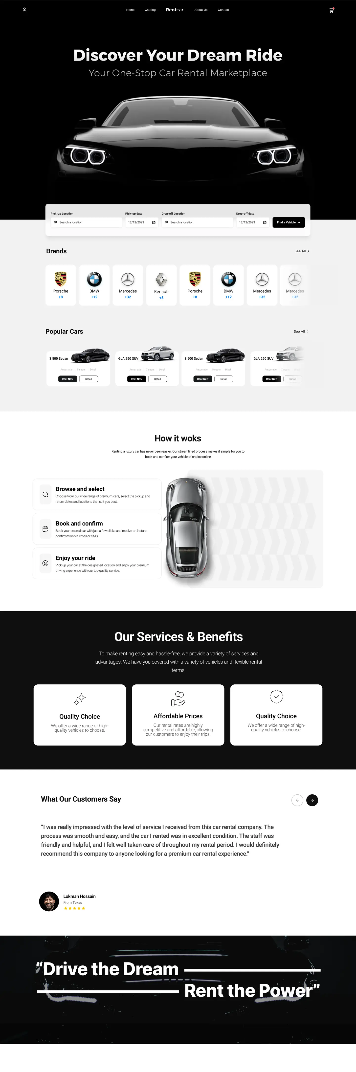
A car rental marketplace in Casablanca, prices in dirhams, designed from the first search to the profile: nine screens that follow the renter’s journey.

The journey, screen by screen

Rentcar home page: the search bar over a car in the dark

Screen 1 of 9

Home. The search first: place and dates in one bar, over the fold, then the makes, the popular cars and how it works.

Scroll inside the screen to see the whole page.

Mobile app · NFT marketplace

ArtChain

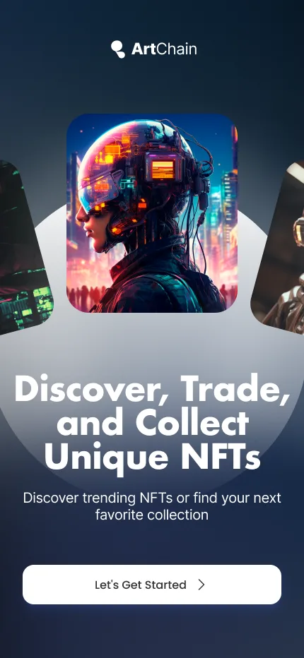
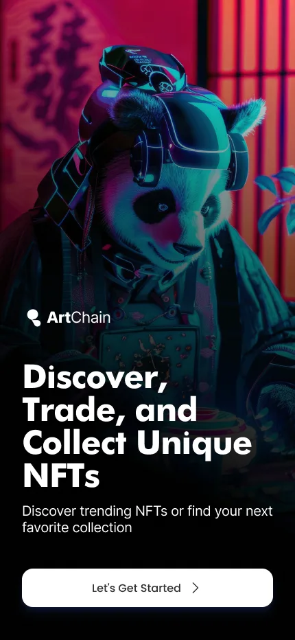
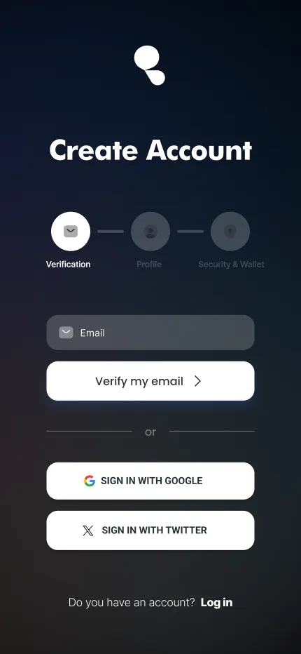
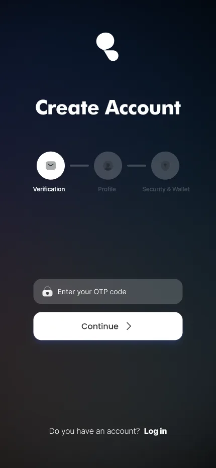
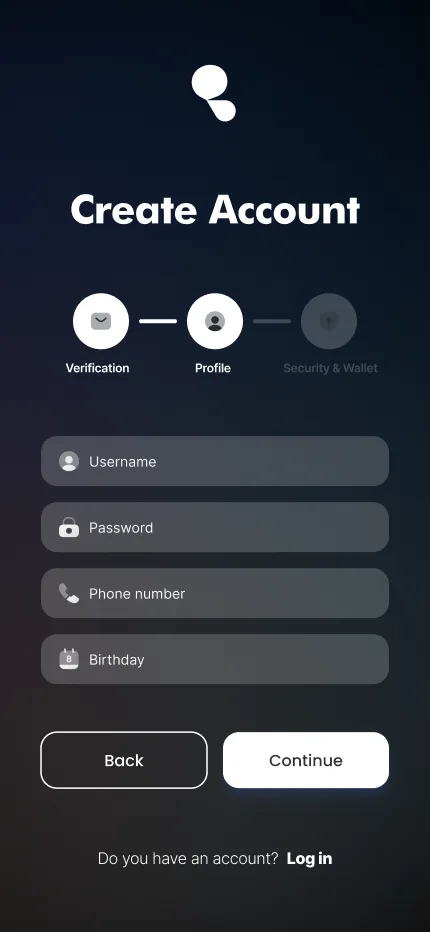
The first minutes in an NFT marketplace: two takes on the welcome, then a sign-up split into three steps so that no screen asks for too much.

  1. Welcome screen with a carousel of artworks

    01 · Welcome

  2. Welcome screen: a panda in neon light

    02 · Welcome, full screen

  3. Sign-up step 1: the e-mail

    03 · E-mail

  4. Sign-up step 1: the one-time code

    04 · Code

  5. Sign-up step 2: the profile

    05 · Profile

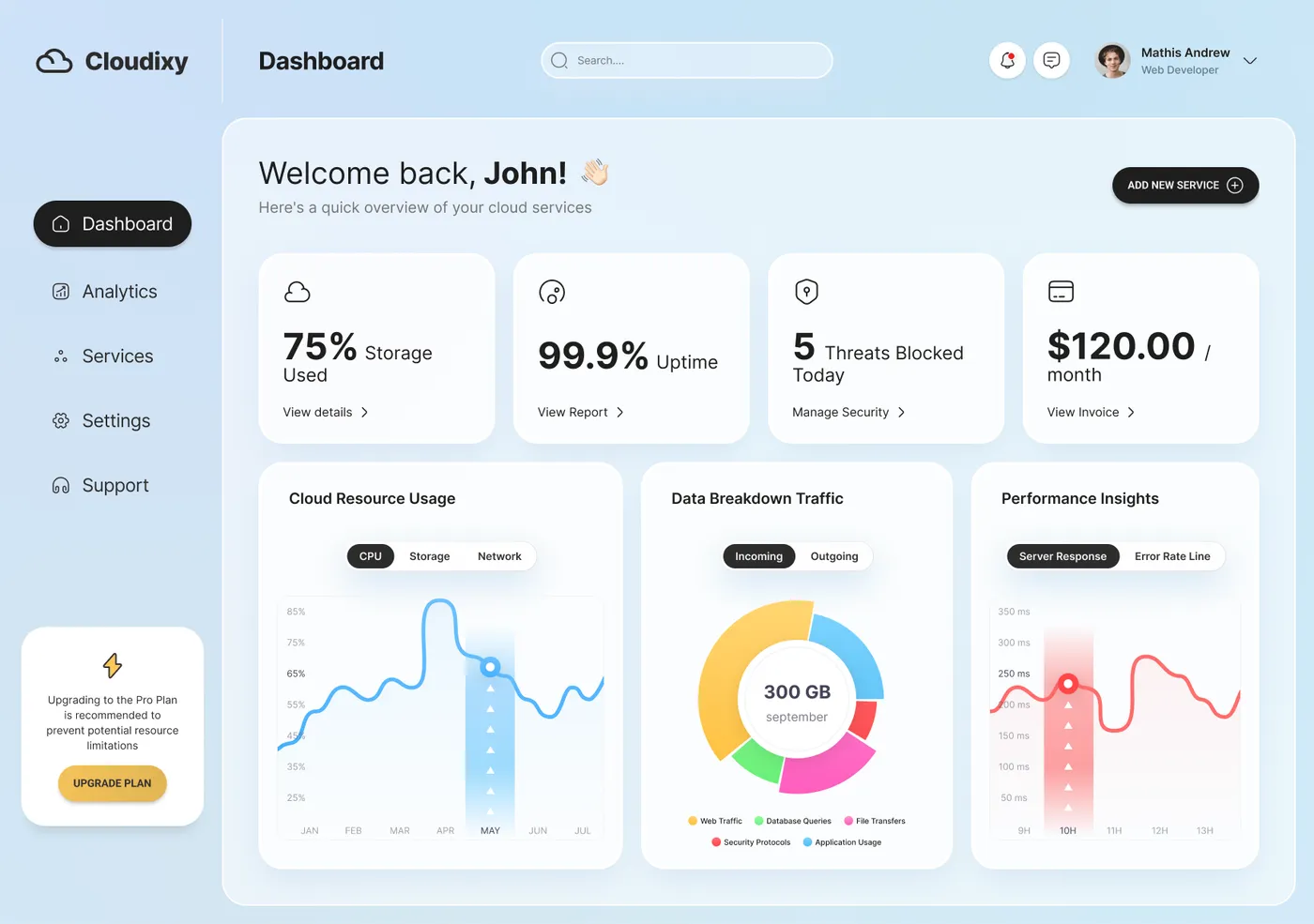
  • Cloudixy dashboard: four key figures and three charts

    SaaS web app

    Cloudixy

    The dashboard of a cloud service: storage, uptime, threats blocked, billing and traffic at a glance.

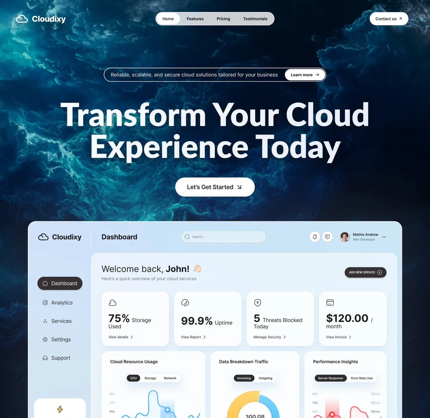
  • Cloudixy landing page: the headline over a dark sea, the dashboard below

    Landing page

    Cloudixy

    The same product’s landing page: the promise, one action, then the dashboard itself.

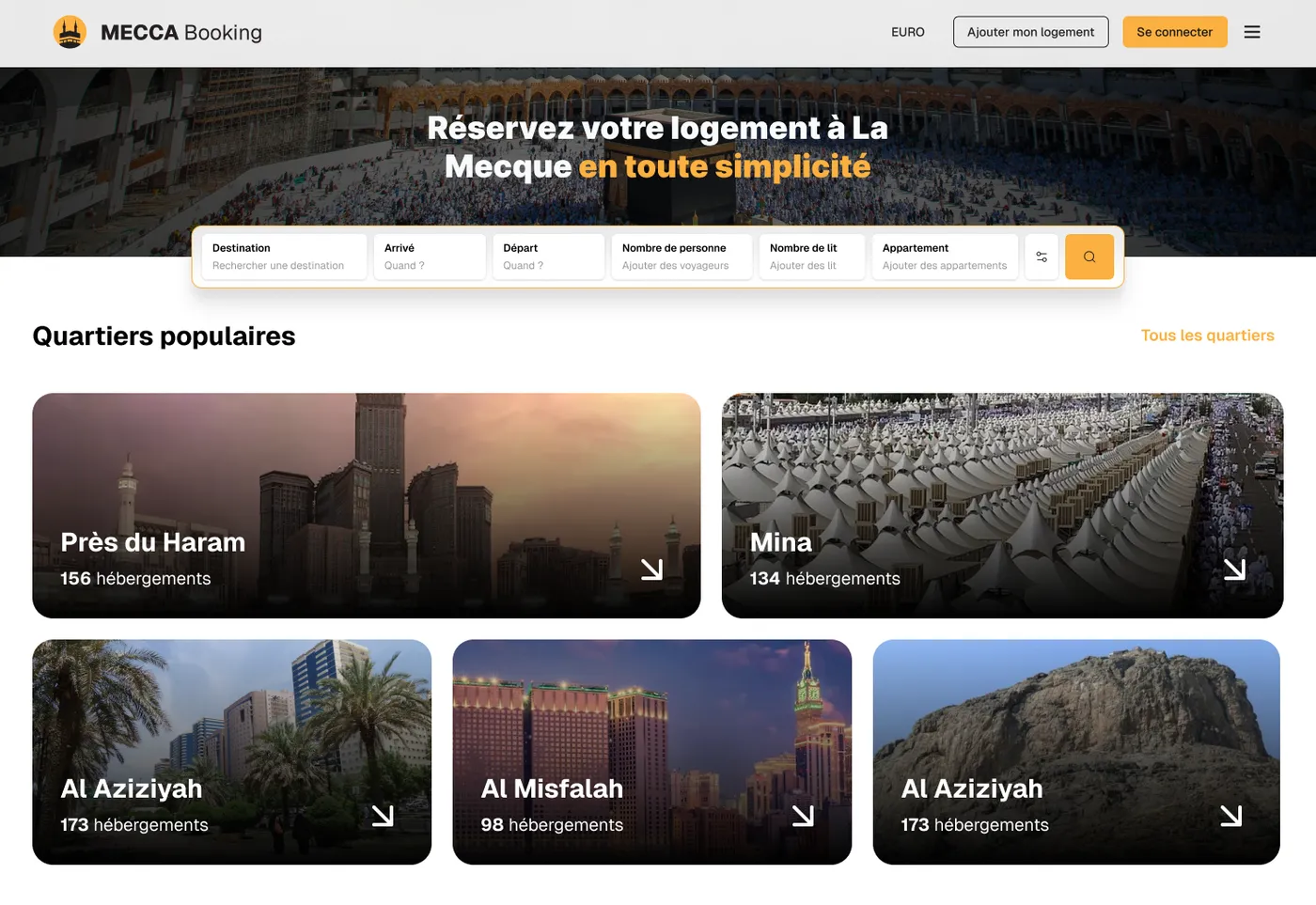
  • MECCA Booking home page: the search bar and the popular districts

    Booking website

    MECCA Booking

    A place to stay near the Haram: one search bar, the popular districts, verified hosts.

Got a project in mind?

Describe the screen or the workflow that gets in the way: I reply with a first reading of the problem.