Case study · No. 01 · Fintech · mobile payments · 2026
Naps, redesigned so people trust it with their money
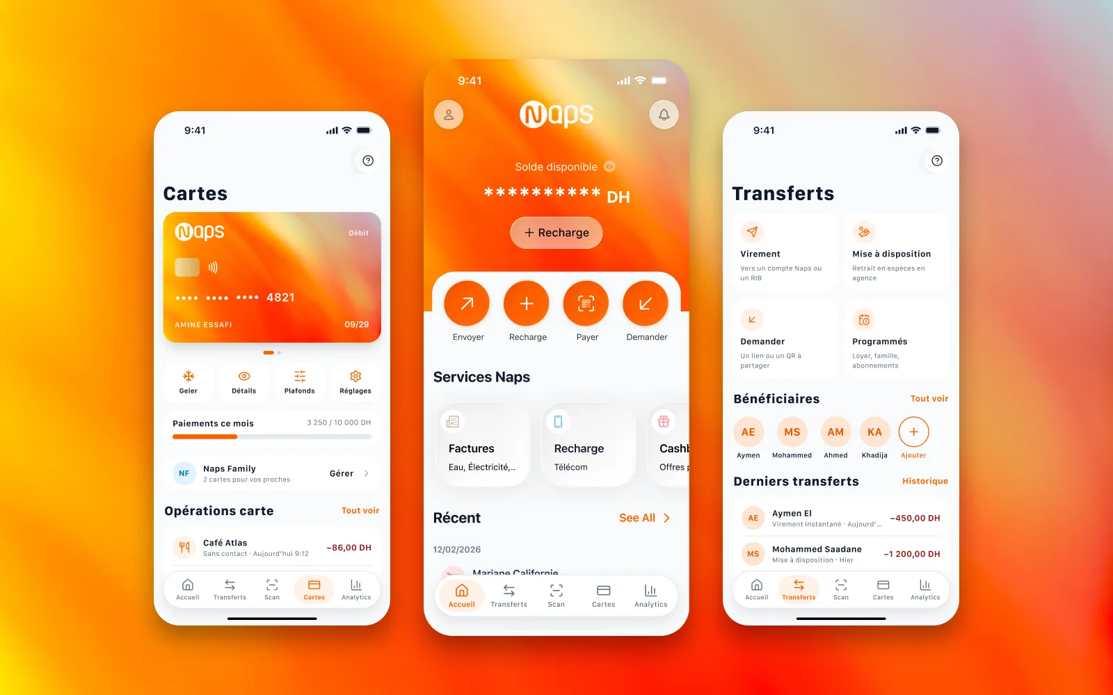
A redesign of the Moroccan payment app Naps: the whole journey, from opening an account to the monthly statement, drawn to win back the trust its store reviews say is gone.
- UX redesign
- iOS UI
- Design system

- Role
- Product designer, from research to prototype
- Duration
- 6 weeks
- Team
- Personal project, solo
- Platform
- iOS, portable to Android
- Tools
 Figma
 Miro
 Google Meet
 Google Docs
- Deliverables
- Audit of the current app, Benchmark, Proto-personas, User flows, Wireframes, Design system, 52 screens, Prototype
The project in numbers
What was delivered, counted in the Figma file. No usage results: the redesign has not been tested with users.
52
high-fidelity screens
16 in the first batch (home, transfer), 36 added to close the loop
9
complete journeys
From opening an account to help, linked in one prototype
2.1 · 2.9
ratings of the current app
Out of 5, App Store (35 ratings) and Google Play (187 reviews), read on 28 October 2026
01 · The project
A payment app people dare not open
Naps is a Moroccan payment institution: an account and a card without a bank, transfers, top-ups and bill payments, run from a mobile app. It also speaks to people without a bank account: at the end of 2024, 58 % of Moroccan adults had one, 46 % among women.
On the stores the app tops out at 2.1 out of 5 (App Store) and 2.9 (Google Play). Reviews describe an app that closes as the code is typed, days without access, fees nobody understood.
The project: redraw the whole journey so that every step reassures, from opening the account to the statement, in the grammar of iOS 26 and the brand's orange. The first batch covered home and transfer; the redesign closes the loop with 36 more screens.
Six weeks, five phases
A tight double diamond: understand before drawing, then draw everything a user goes through.
01 · Weeks 1–2
Discover
The current app on the stores, the 62 written reviews, a tear-down of four competing apps.
- Heuristic audit
- Review analysis
- Benchmark
02 · Weeks 2–3
Define
Four proto-personas, the experience map of a transfer, the “How might we…” questions.
- Proto-personas
- Journey map
- HMW
03 · Weeks 3–4
Ideate
Feature prioritisation, user flows, wireframes of the two key journeys.
- Impact × effort
- User flow
- Wireframes
04 · Weeks 4–6
Prototype
A design system on the iOS 26 kit, 52 screens, a linked prototype, a success animation.
- Design system
- High-fidelity UI
- Figma prototype
05 · Weeks 6–6
Check
A review against UX laws and contrast, a test plan ready to run.
- Heuristic review
- WCAG 2.2
- Test plan
02 · Discovery
The ground, in sourced figures
A country where nearly one adult in two is still outside the bank, and an app its own users rate harshly.
58 %
of Moroccan adults hold a bank account
End of 2024, up from 54 % in 2023.
46 %
among women
Against 70 % among men: the gap a bankless account aims at.
22 / 57
Google Play reviews at 1 or 2 stars
Among the written reviews the listing shows.
< 20 s
to send money to someone close
The redesign's ambition, from home to receipt, with a known payee.
Hypothesis
Sources read on 28 October 2026. Six 5-star reviews posted on the same day (15 December 2023) were read with caution.
What the reviews say
Six precise frictions, quoted as written, then the two strengths the redesign keeps. Reviews too vague to act on (“Bad app”) are left out.
Strengths to keep
What users keep
F+1
An account without a bank
« Excellente solution d’inclusion financière pour les non bancarisés et pour les touristes qui visitent le Maroc. »
Translation · An excellent financial inclusion solution for the unbanked and for tourists visiting Morocco.
Google Play · October 2019 What it tells usThe “no bank needed” promise stays at the heart of home.
F+2
Paying on the spot, without cash
« Pratique pour aller au stade sans avoir besoin de retirer le billet »
Translation · Handy for going to the stadium without having to withdraw cash.
Google Play · July 2023 What it tells usQR payment and the card must be one gesture away.
Frictions to fix
What makes them leave
F1
Signing in fails
« Je souhaite simplement pouvoir consulter mon compte, mais je n’arrive jamais à me connecter à cause du même problème qui persiste. »
Translation · I just want to check my account, but I can never sign in because of the same problem that persists.
App Store · September 2026 What it tells usSigning in is the first gesture: if it fails, nothing else exists.
F2
The app closes on the last digit
“Just when I enter the last digit of my password the app closes itself just like that”
App Store · December 2025 What it tells usA crash at the code reads like a security breach.
F3
Days without access
“there are multiple consecutive days when it is down and refuses to open!”
App Store · September 2026 What it tells usWithout a visible service status, an outage looks like a disappearance.
F4
The remaining balance, nowhere
« Problème de savoir le reste de solde de monnaie après la recharge de dotation. »
Translation · Trouble knowing the remaining balance after topping up the travel allowance.
Google Play · May 2026 What it tells usAfter every operation, the remaining balance must read at a glance.
F5
A sign-up with no news
« J’ai créer mon compte et jusqu’à ce jour je n’est jamais eu de suite. »
Translation · I created my account and to this day I have never heard back.
Google Play · June 2022 What it tells usOpening an account must say where the request stands.
F6
The card is ordered at a branch
« Je suis à rabat impossible de commander ma carte en ligne ni en appelant. Je dois venir dans un agence à Casablanca. »
Translation · I’m in Rabat, I can’t order my card online or by phone. I have to go to a branch in Casablanca.
Google Play · April 2022 What it tells usOrdering a card must happen in the app.
Reviews read on the public listings on 28 October 2026, quoted uncorrected; their authors are not named.
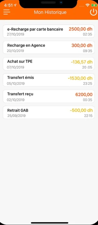
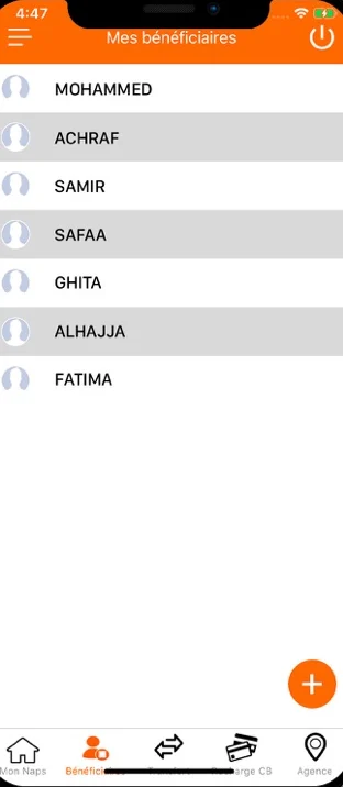
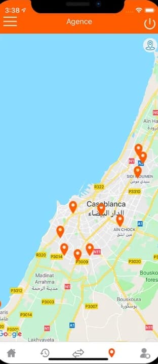
The current app, as the stores show it
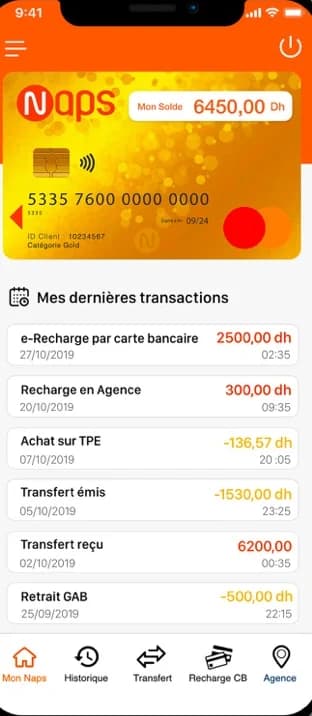
The captures Naps publishes: a gold card atop every screen, plain-text lists, five tabs and a menu.
History
Payees
Branches
Today’s home, annotated
A capture from the App Store listing. Tap a point: the finding, the UX law at stake and the redesign’s answer.
Points found
The amount sits in a label in the corner of the card picture, smaller than the card number.
UX law at play
Von Restorff Effect
The one thing that differs is the one thing remembered.
Proposed fix
The balance becomes the screen's headline, hidden with one gesture.
Four apps taken apart
Three Moroccan players and Revolut, the usage benchmark, checked against the same criteria as the redesign.
| Criterion | Naps · redesignThe project | CIH MobileBank | Al Barid BankBank | Cash PlusPayments | RevolutBenchmark |
|---|---|---|---|---|---|
| Transfer in a few gestures | Yes4 steps, Face ID | No6 to 7 taps, SMS code | Not documented | PartlyInstant option in view | Yes2 gestures |
| Number pad for amounts | Yes | Not documented | NoAZERTY keyboard | Not documented | Yes |
| Hide the balance | YesOne gesture | Not documented | Not documented | Not documented | YesBy shaking |
| Budget and spending by category | Yes | Not documented | Not documented | NoNo tool | YesMonthly, very visual |
| Entering a RIB without errors | PartlyRecents, scan planned | Not documented | NoAZERTY keyboard | No24 digits by hand | Not applicableNo Moroccan RIB |
| A receipt to share | YesPDF | Not documented | Not documented | YesPDF on WhatsApp | Yes |
The table scrolls sideways.
From the tear-down done for the study, on captures of the four apps. “Not documented”: not observed.
Takeaway
Revolut sets the standard, the local players own the ground (RIB, Arabic, branches). The redesign takes the ease of one and the context of the others.
03 · Definition
Four ways of holding money
Proto-personas drawn from the reviews and the Moroccan context: hypotheses to validate in interviews; their quotes are illustrative.
P1 · proto-persona
Yassine, 28
Tech manager in Casablanca, several transfers a week
- Goal
- Send money to a friend in seconds and keep track of spending
- What gets in the way
- SMS codes that lag, passwords, slow apps
« I want to send money to a friend in under 15 seconds. »
P2 · proto-persona
Kenza, 23
Student in El Jadida, lives on a grant and family money
- Goal
- Know what she has left, ask her family for an advance
- What gets in the way
- Fear of hidden fees, a balance that drops without her knowing why
« I want to know right away how much I have left. »
P3 · proto-persona
Hassan, 54
Field sales sourcer, moved to digital because he had to
- Goal
- Send his RIB to a client on WhatsApp, without a mistake
- What gets in the way
- Can't remember 24 digits, reads poorly in full sun
« My RIB, in one gesture, without a mistake. »
P4 · proto-persona
Amina, 42
Self-employed hairdresser, no bank account, pays cash
- Goal
- Pay her bills without queueing, top up with cash
- What gets in the way
- Banking jargon, fear of losing money on the wrong button
« A simple wallet I top up when I have cash. »
The research file's portraits, generated by AI, are not shown.
A transfer, today
The current app's journey, as Yassine lives it. The emotions are a hypothesis drawn from reviews F1 to F4.
Yassine
01Open the app
02Sign in
03Find the transfer
04The payee
05Confirm
06After
Does
Thinks
Feels
Opportunity
The map scrolls sideways.
The problem to solve
Naps users need to be sure of their money at every step, because a payment app does not forgive a mistake. Today, signing in fails, the balance hides and fees show up afterwards.
The questions the design answers
Q1
How might we make signing in instant, and reassuring when it fails?
Why this one · Three frictions out of six are about access (F1 to F3).
Q2
How might we make sending money to someone close a matter of seconds?
Why this one · It is the main use, tucked away in two menus.
Q3
How might we show every fee before it is paid?
Why this one · Fees felt as hidden come back in the reviews and for Kenza.
Q4
How might we serve people who have no bank?
Why this one · It is the strength the positive reviews name (F+1).
04 · Ideation
What the first version keeps
Each feature placed by its impact on the frictions and the effort it takes. Big bets stay when a friction calls for them.
Impact ↑
Quick wins · Impact high · Effort low
Face ID sign-inIn V1
Answers F1 and F2
Fees and total before payingIn V1
Answers Q3
Balance as headline, hideableIn V1
Answers F4
Four-step transferIn V1
Big bets · Impact high · Effort high
Cash pick-up at a branchIn V1
The heart of “no bank needed”
QR payment at a merchantIn V1
Answers F+2
Cards: freeze, limits, online cardIn V1
RIB scanLater
Needs a reading engine
Arabic interface (RTL)Later
Architecture ready, screens in V2
Nice to have · Impact low · Effort low
Cashback at partnersIn V1
Dark themeLater
Later · Impact low · Effort high
Naps FamilyIn V1
An existing Naps offer
Effort →
Impact estimated from the frictions and personas, effort by expert judgement: a ranking to review with the engineering team.
The transfer, step by step
The target flow: a known payee is paid in four screens, a new one in two more.
Start
Home
Quick action “Send”
Decision
Existing payee?
No: enter the RIB and name, then “Save”
Screen
Pick the payee
Recents first
Screen
Amount
Number pad, instant option
Screen
Review
Amount, fees, total
System
Face ID
No code to type
End
Success and receipt
A receipt to share
From the research file's user flow.
The wireframes
The first batch's two journeys in mid fidelity: the transfer, then the spending module.
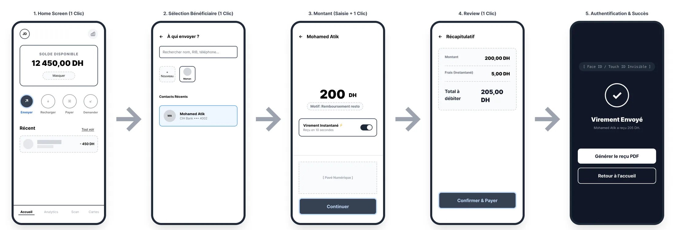
Transfer: five screens, one tap each. 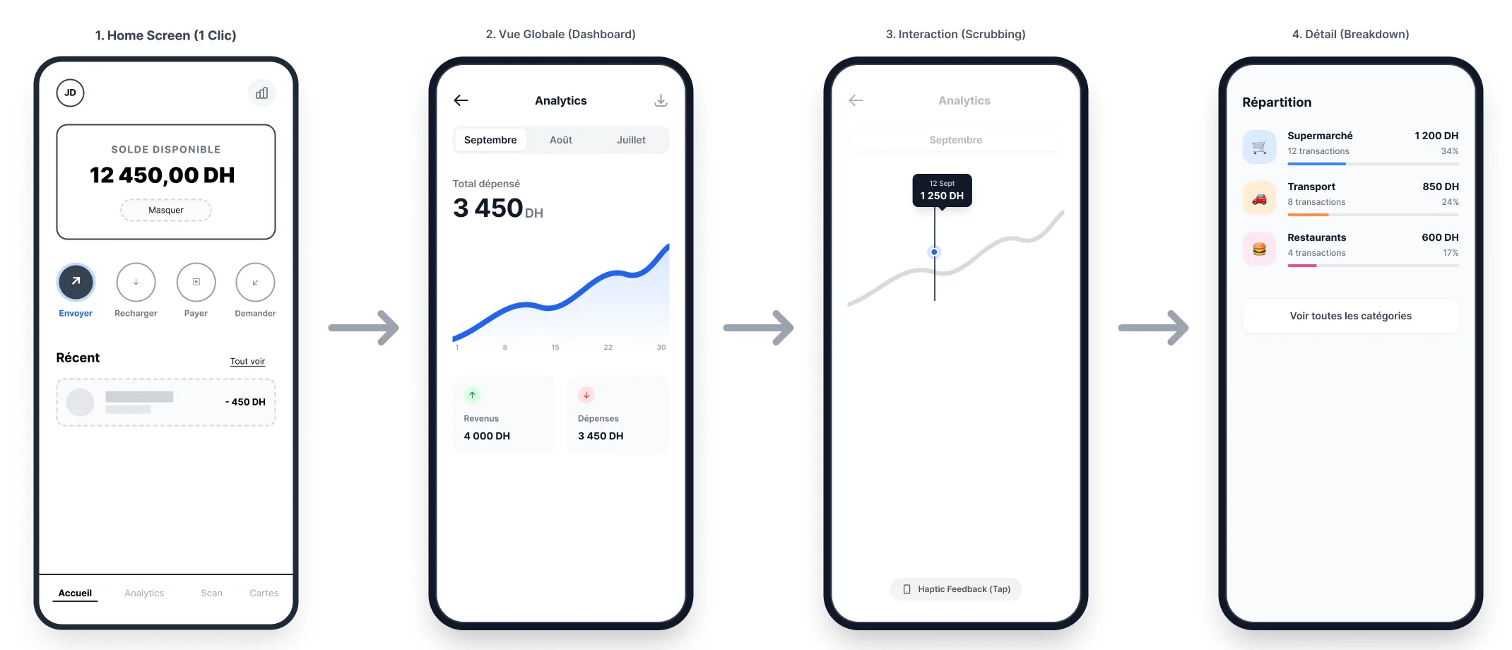
Spending: the month's view, the curve you scrub with a finger, then the split.
05 · Design
A design system on the iOS 26 kit
The base is native (glass, bars, Dynamic Type): the brand adds only an orange, kept for action, and a scale for amounts.
Colours
Naps orange
#FF5F00
Main action, toggles
Deep orange
#E65500
Initials, accents on light
Ink
#0F172A
Text, icons
Slate
#64748B
Secondary text
Background
#F8FAFC
Screen background
Card
#FFFFFF
Cards and lists
Credit
#065F46
Money received
Debit
#991B1B
Money sent
Success, fill
#D1FAE5
Paid status
Error, fill
#FEE2E2
Card block, alert
Type
Large title
SF Pro Bold 34
Send money
Balance
Inter Bold 32
122,390.28 DH
Section
SF Pro Bold 22
Naps services
Row
SF Pro Semibold 15
Aymen El
Caption
SF Pro Regular 13
CIH Bank •••• 4589
15 components
- Floating tab bar
- Toolbar
- Glass Prominent button
- Glass button
- Quick action
- Service card
- List row
- Search
- Field
- Toggle
- Number pad
- Naps card
- Status pill
- Success mark
- 86 icons
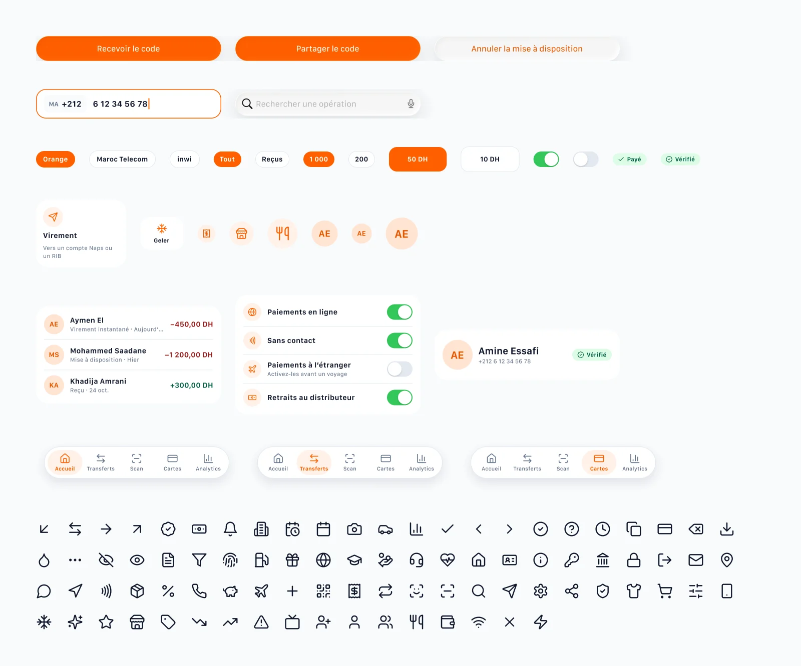
White text on the brand orange reaches 3:1: enough for a bold button label from 18 points, not for body text (WCAG 2.2, 1.4.3).
Home: the balance first
Today
Redesign
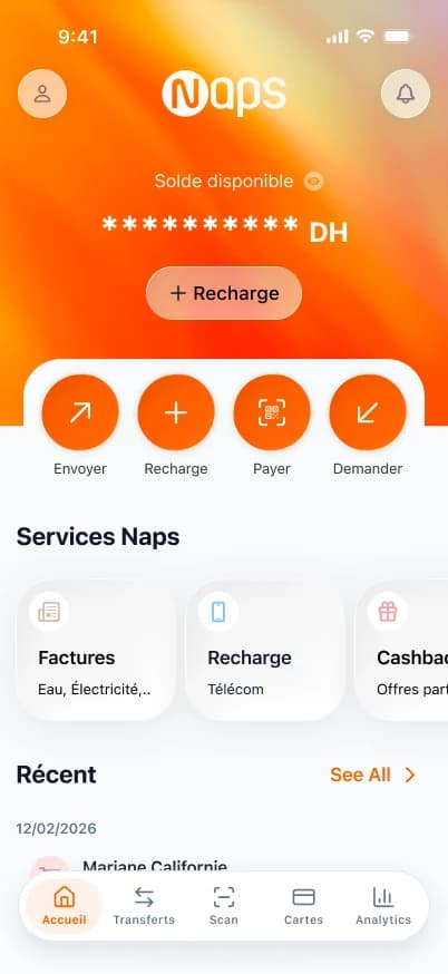
What changes
The balance becomes the screen's headline, hidden with one gesture.
UX law · Von Restorff EffectKept
The card number leaves home: it lives in “Details”, masked.
UX law · Jakob’s LawKept
Four actions up top: send, top up, pay, request.
UX law · Hick’s LawKept
Debits in red, credits in green, always with their sign.
UX law · Law of SimilarityKept
The transfer: see it all before paying
Today
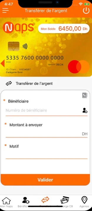
Redesign
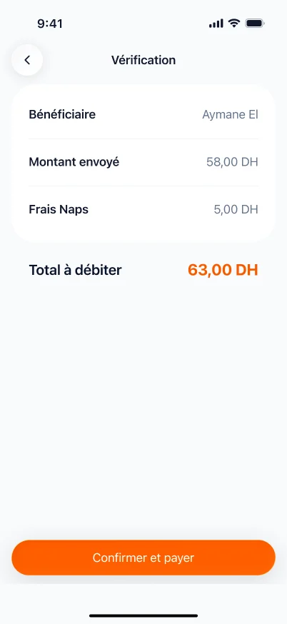
What changes
The payee is picked from recents, or added with their RIB: no internal number to know.
UX law · Tesler’s LawKept
Amount, fees and total show before confirming.
UX law · Loss AversionKept
Face ID confirms the transfer: no code to type at the wrong moment.
UX law · Doherty ThresholdKept
Signing in: one gesture, and a first name
Today
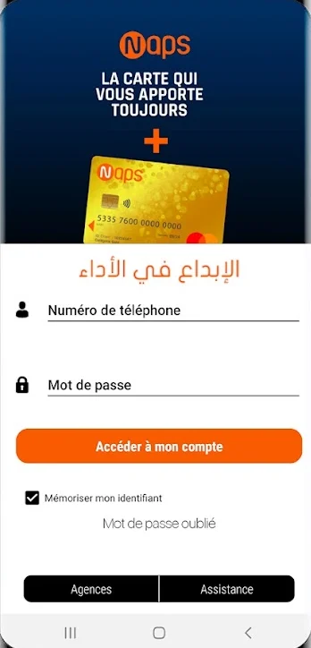
Redesign
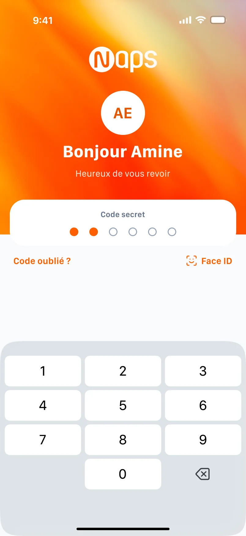
What changes
Face ID in one gesture, a six-digit code as fallback.
UX law · Doherty ThresholdKept
The app greets by first name: you know you are home.
UX law · Aesthetic-Usability EffectKept
“Forgot your code?” is on screen, no need to call.
UX law · Postel’s LawKept
A success that reassures
The first success screen celebrated with a megaphone. With money, the party matters less than the proof: the redesign sets a check in a halo, the amount and the payee, then the receipt to share.
Three Smart Animate states grow the circle, draw the check, then open the halo: the end of the journey is the moment people remember.
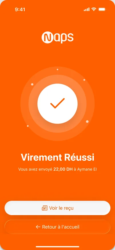
Transfer sent
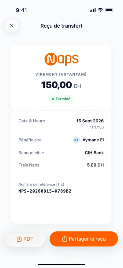
The receipt, as a PDF
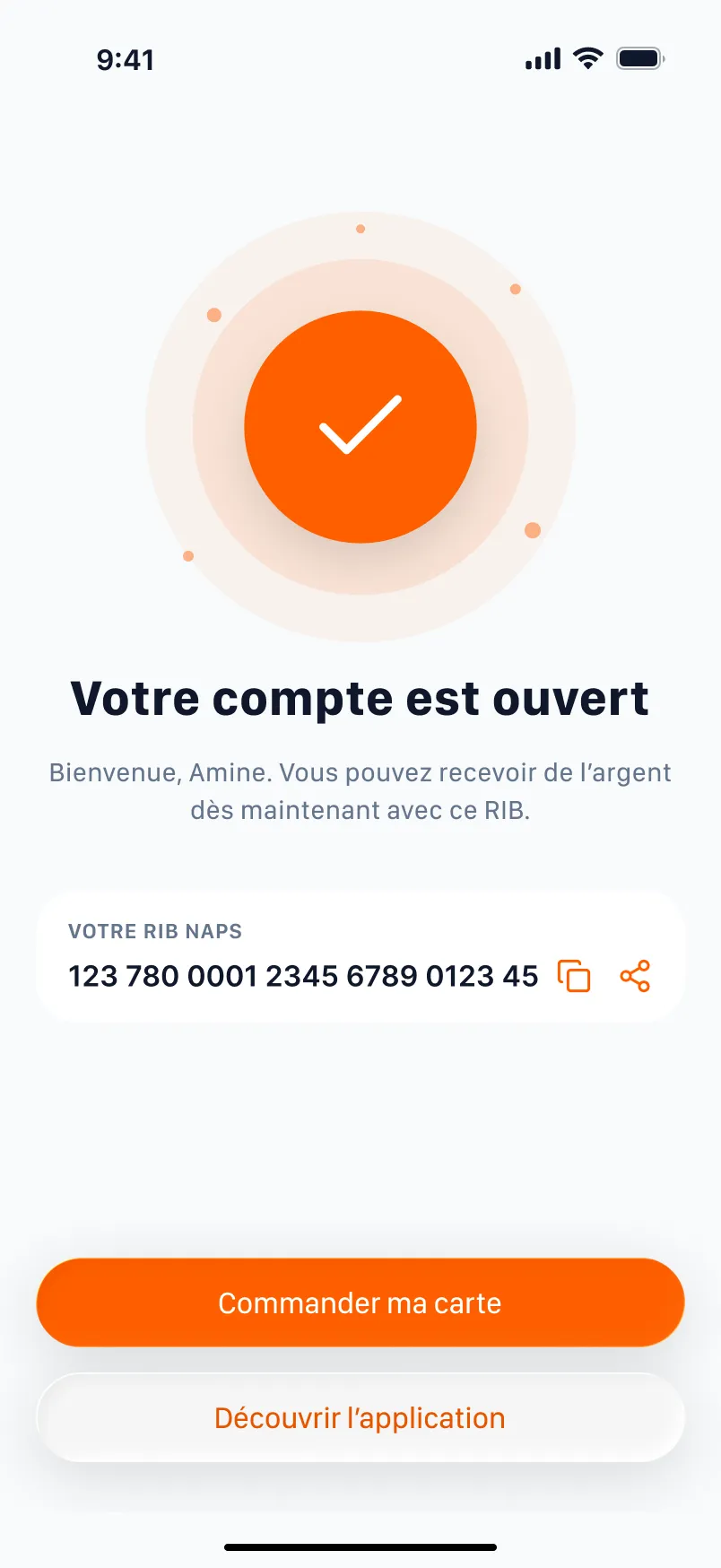
The same mark when the account opens
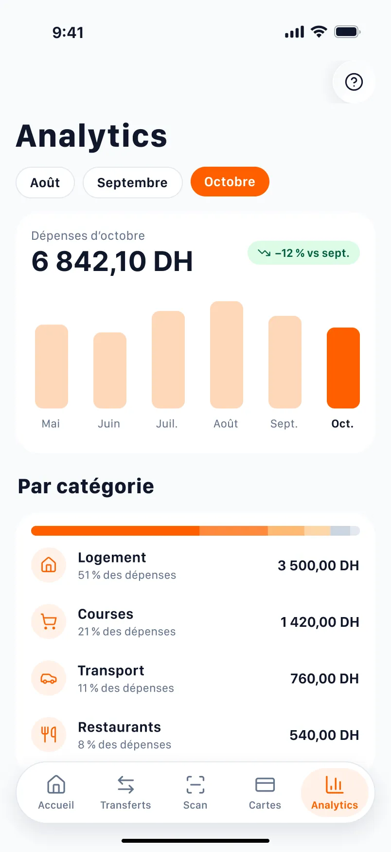
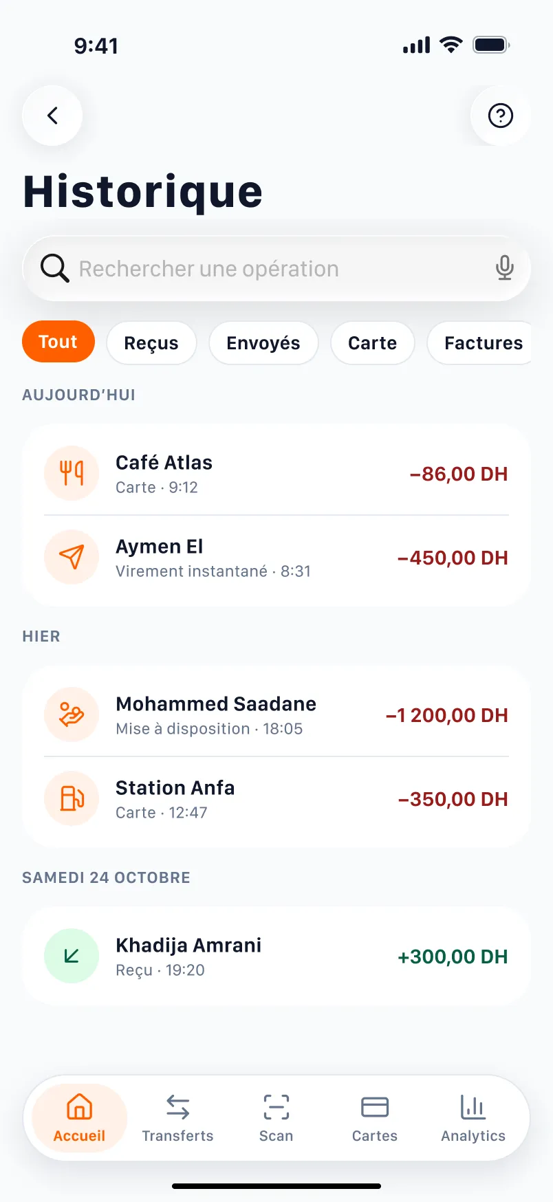
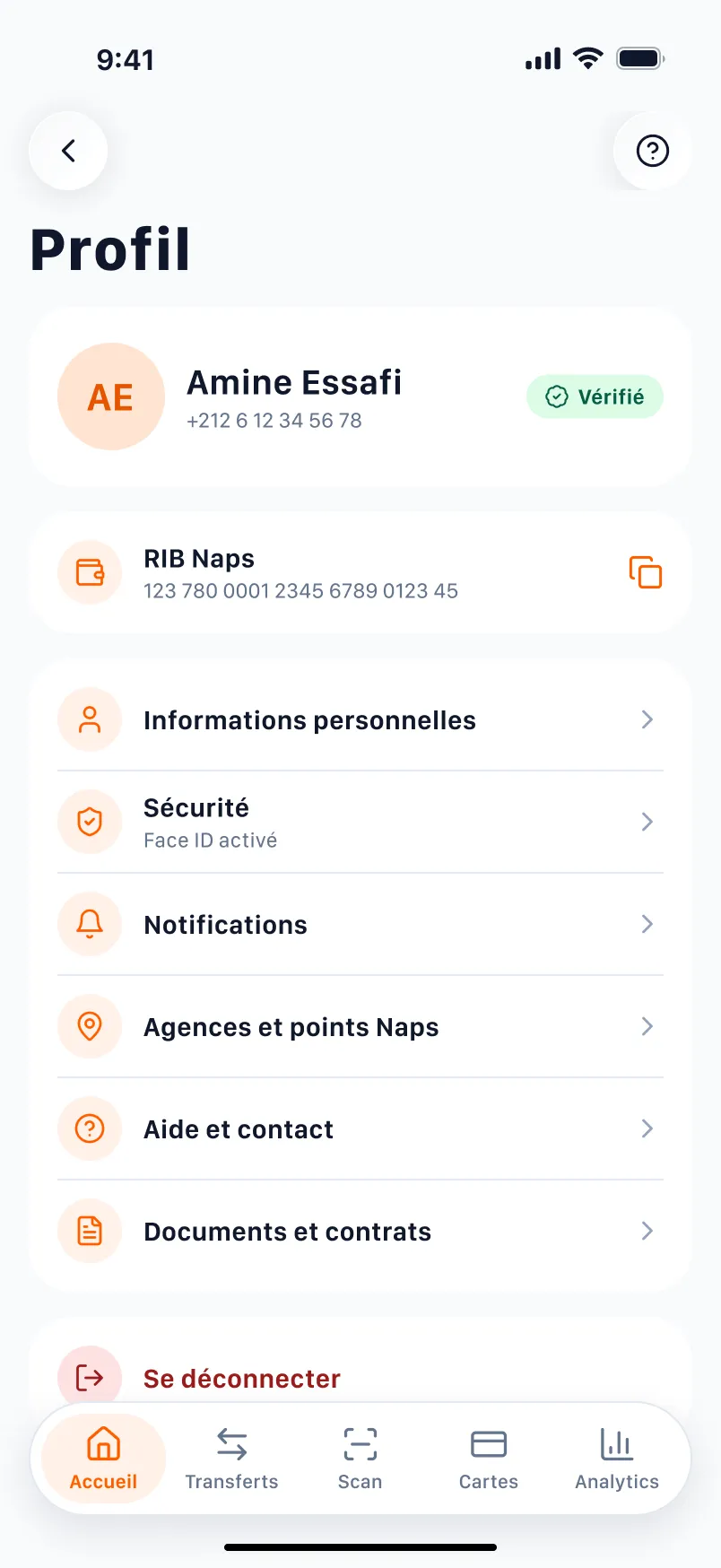
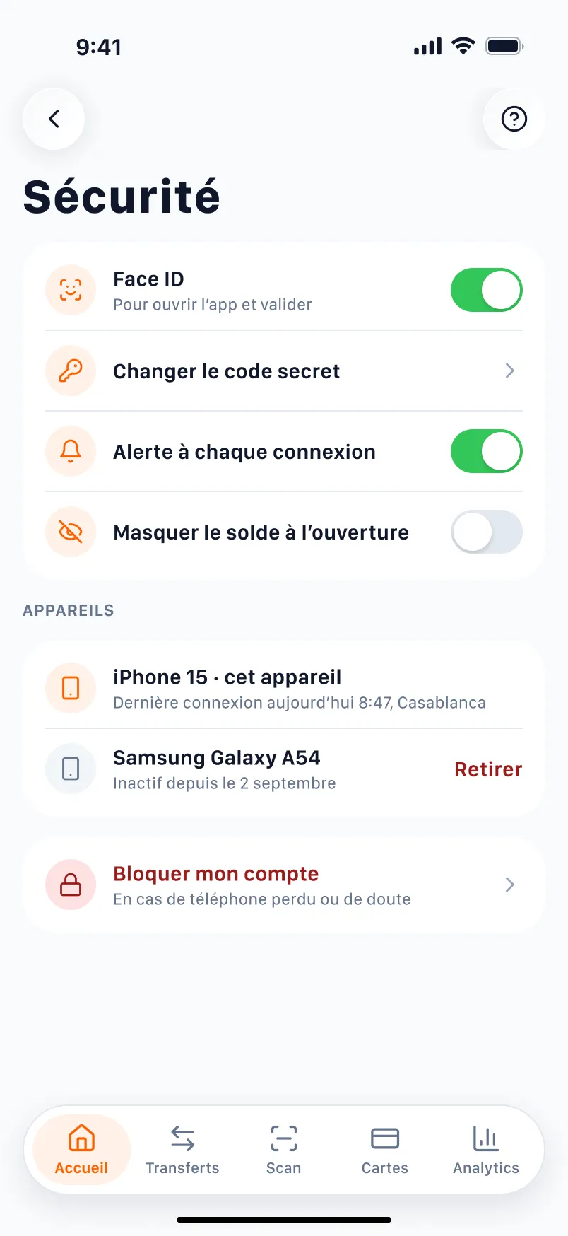
Closing the loop: 36 more screens
From opening an account to help: each screen answers a friction or a question of the problem.
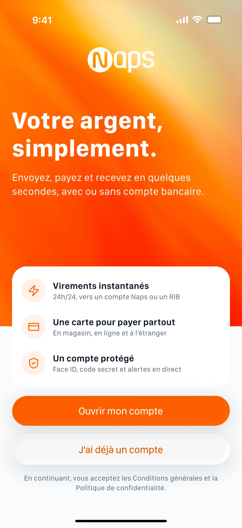
Welcome
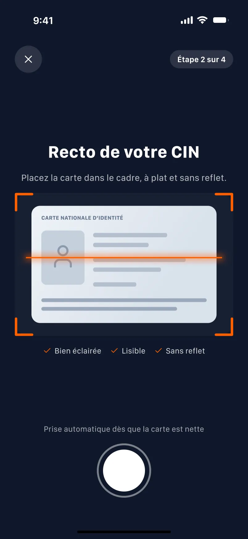
ID card (F5)
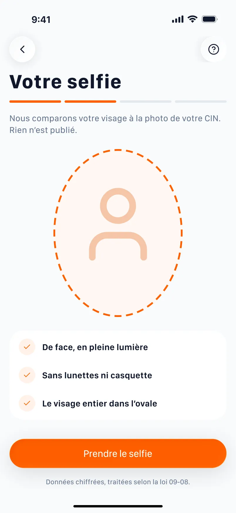
Selfie
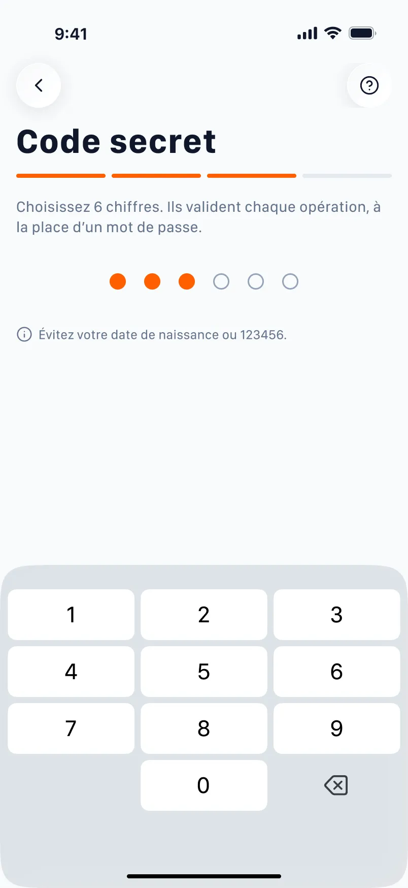
Secret code
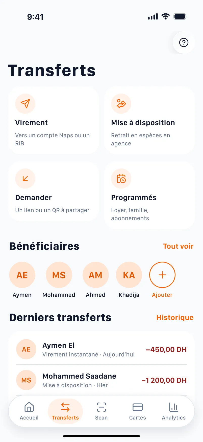
Transfers
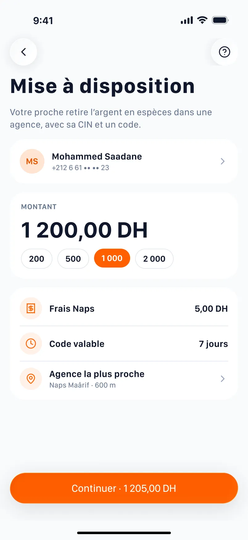
Cash pick-up
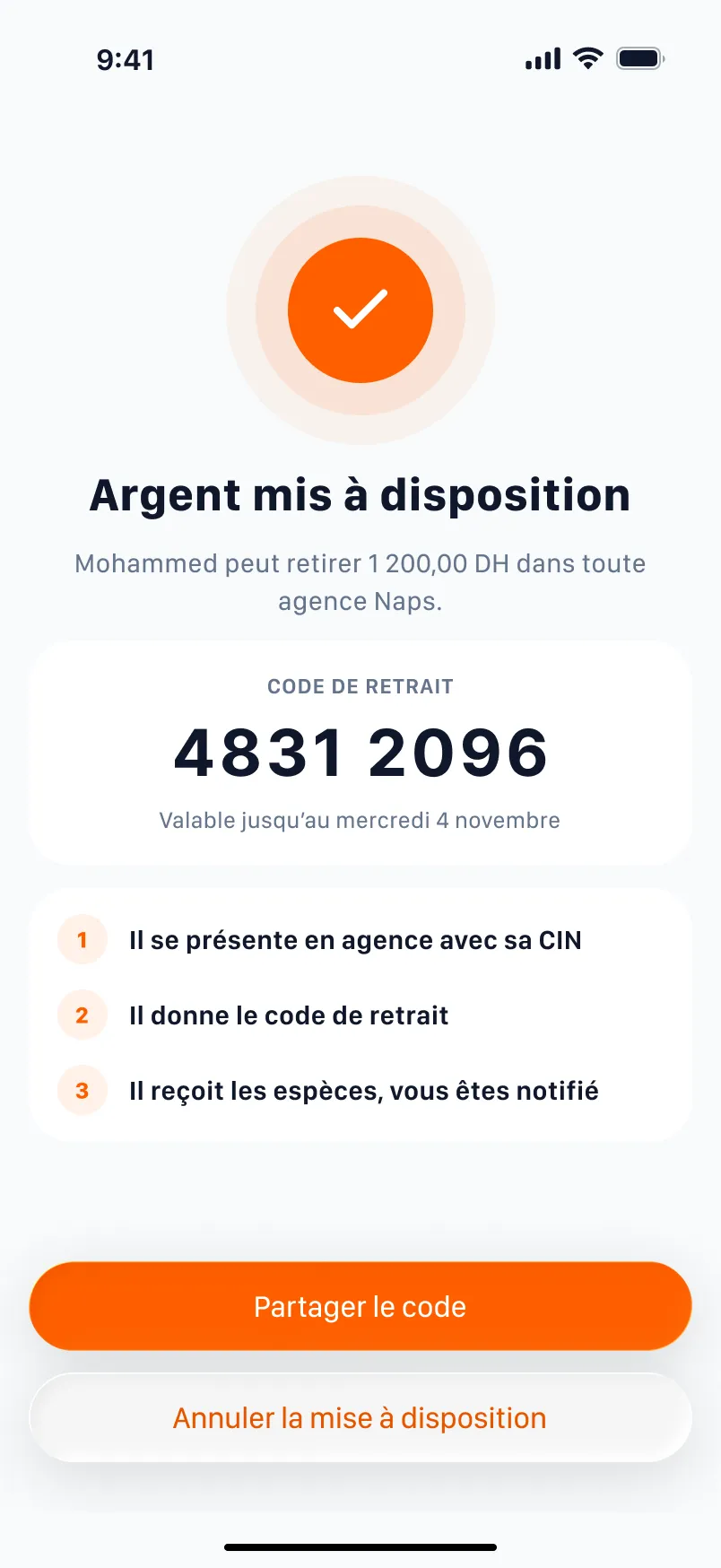
Withdrawal code
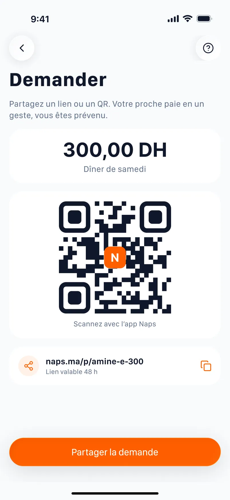
Request (Kenza)
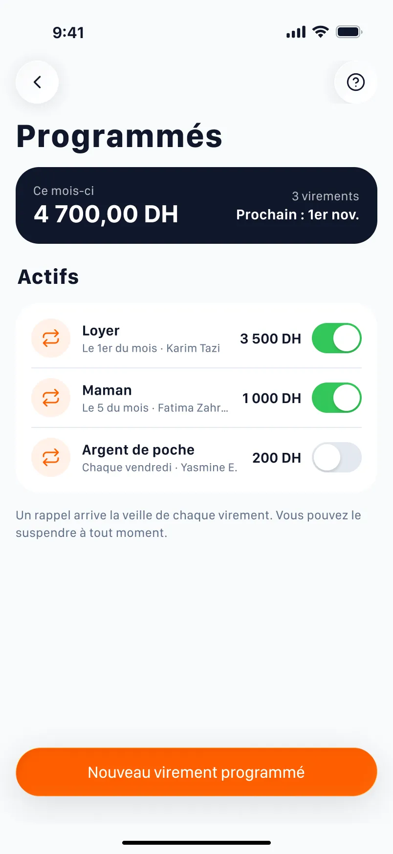
Scheduled
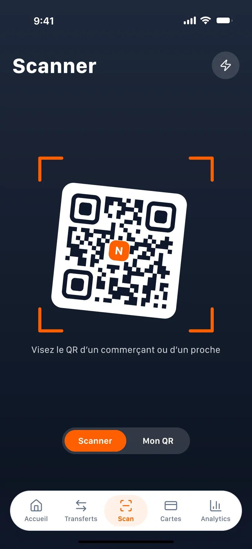
Scan (F+2)
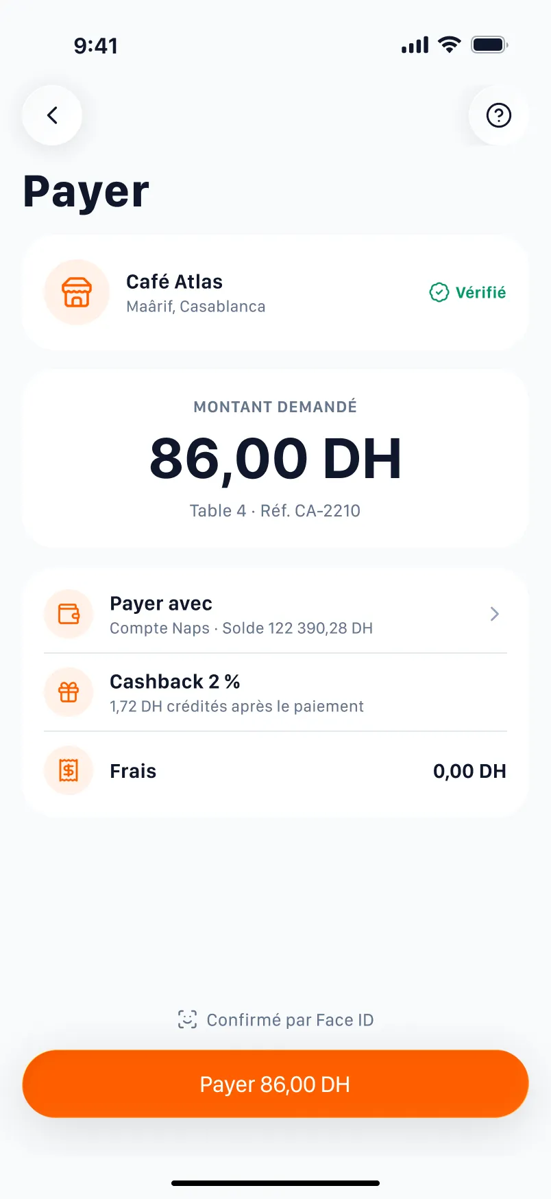
Pay a merchant
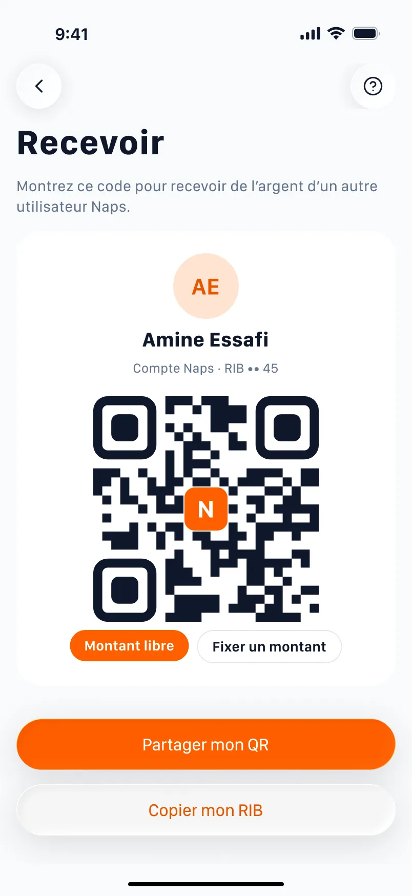
My QR (Hassan)
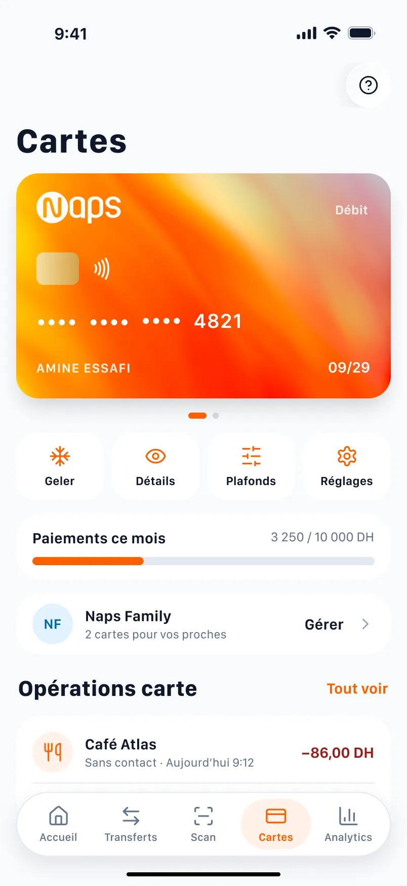
Cards
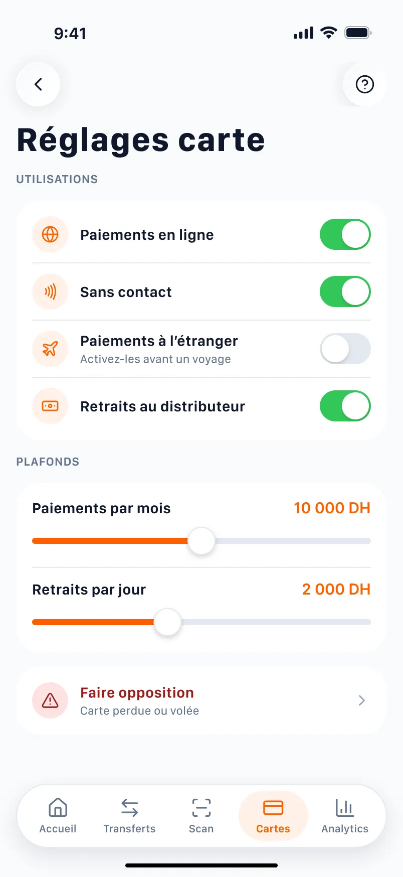
Card settings
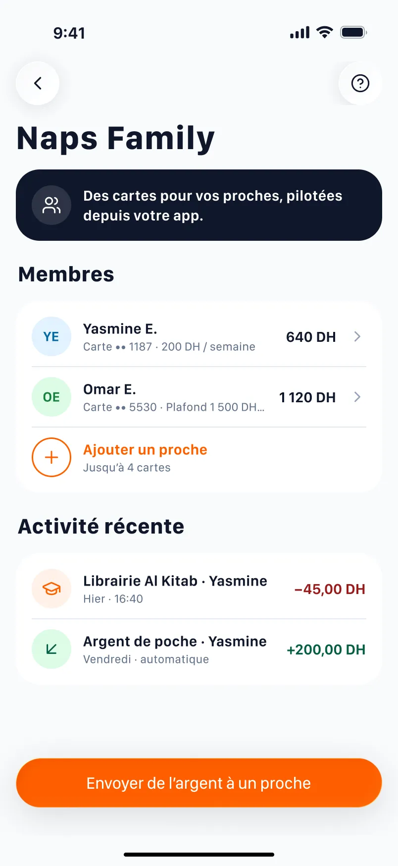
Naps Family
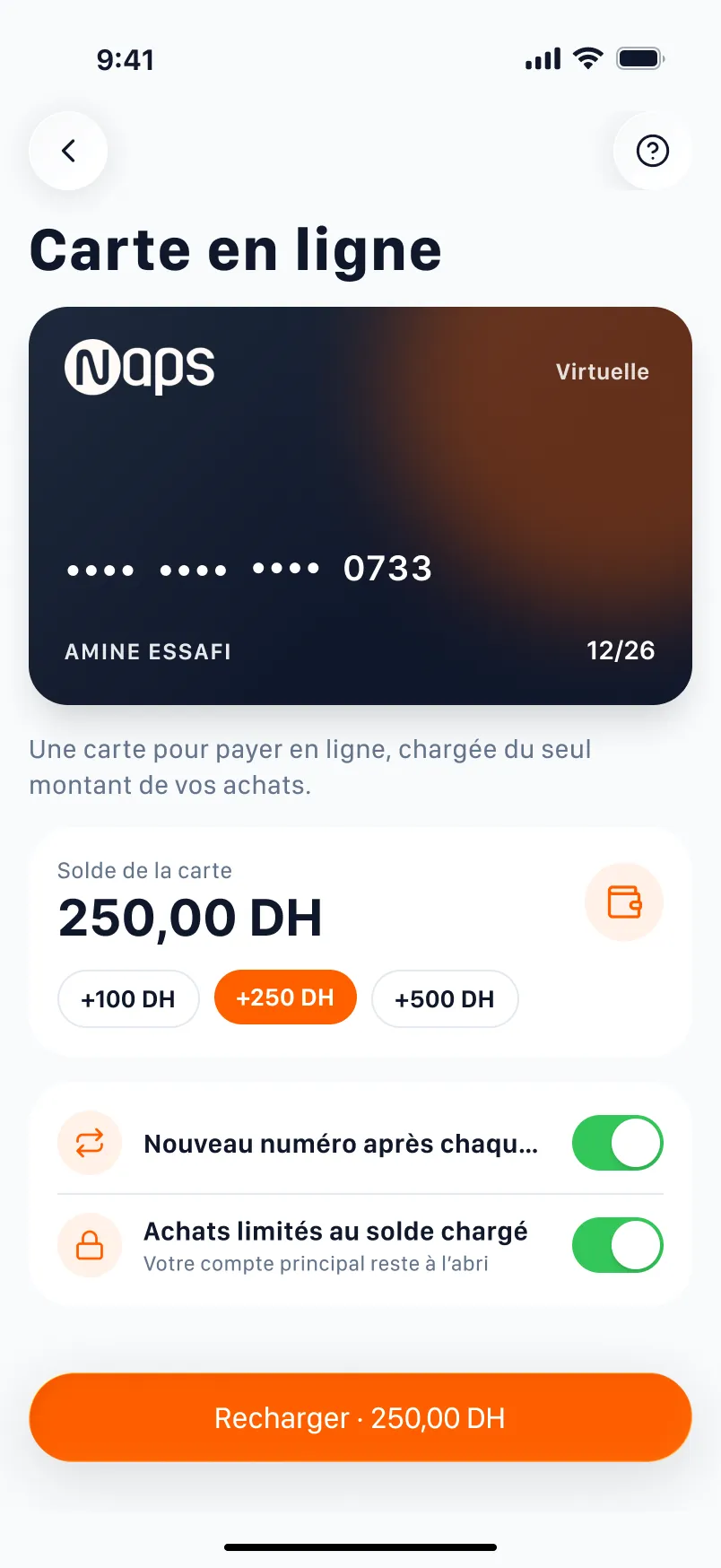
Online card
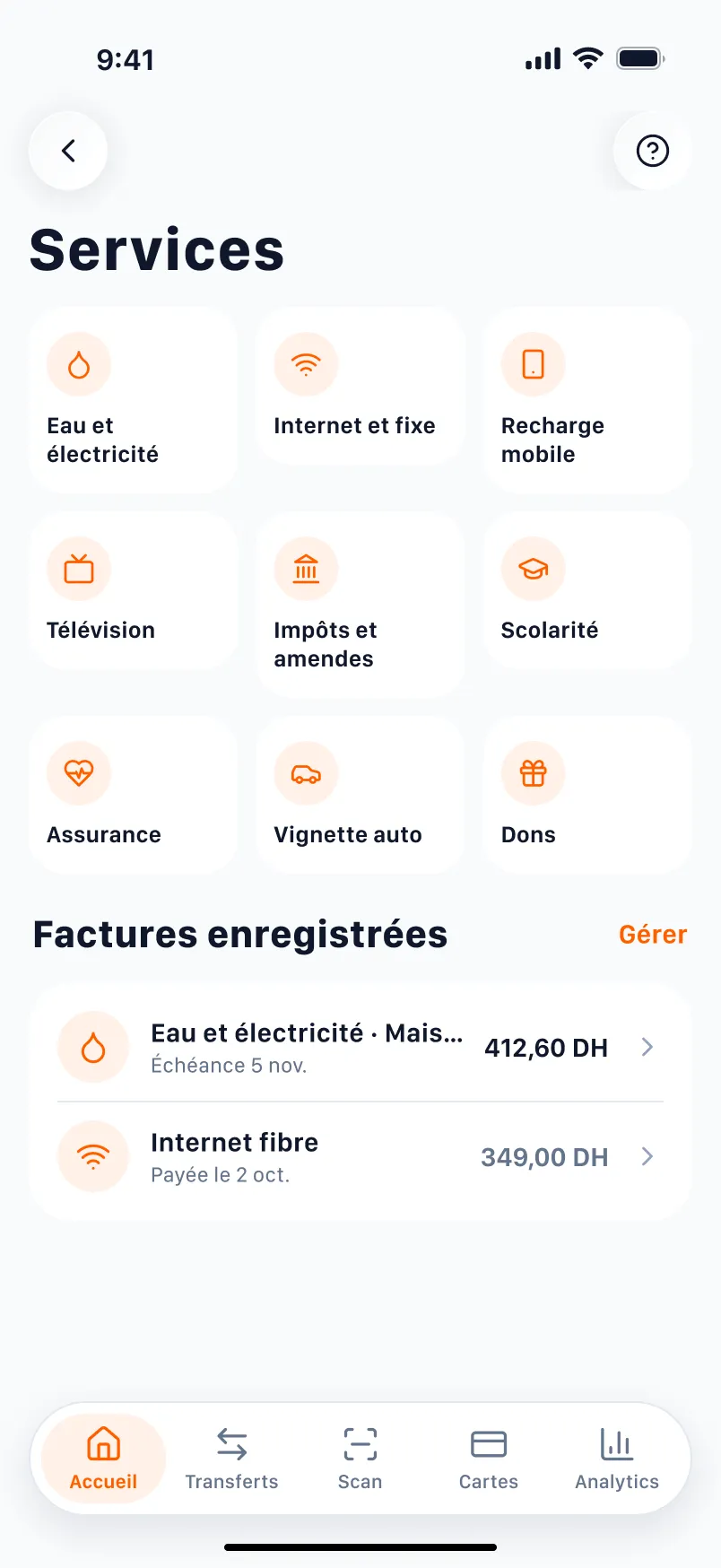
Services (Amina)
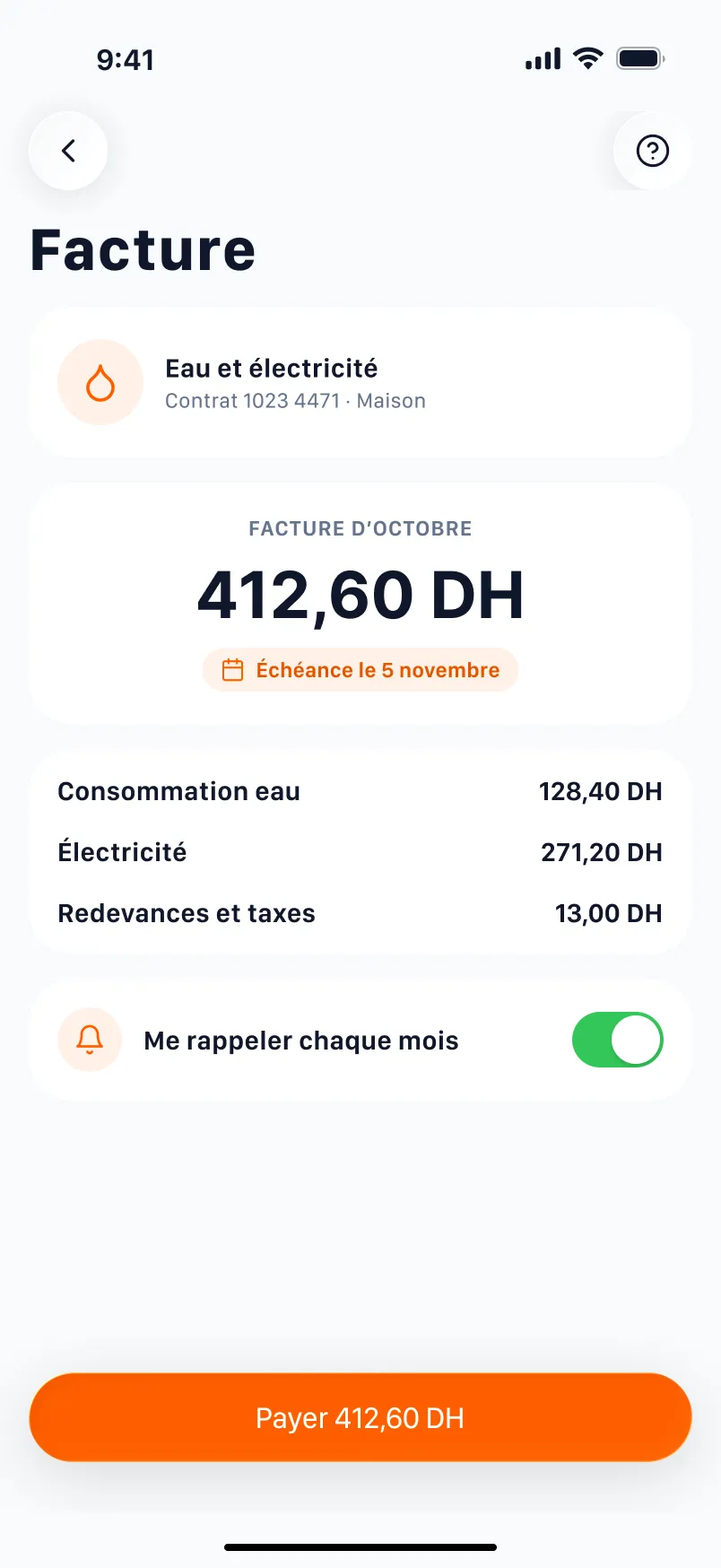
Bill
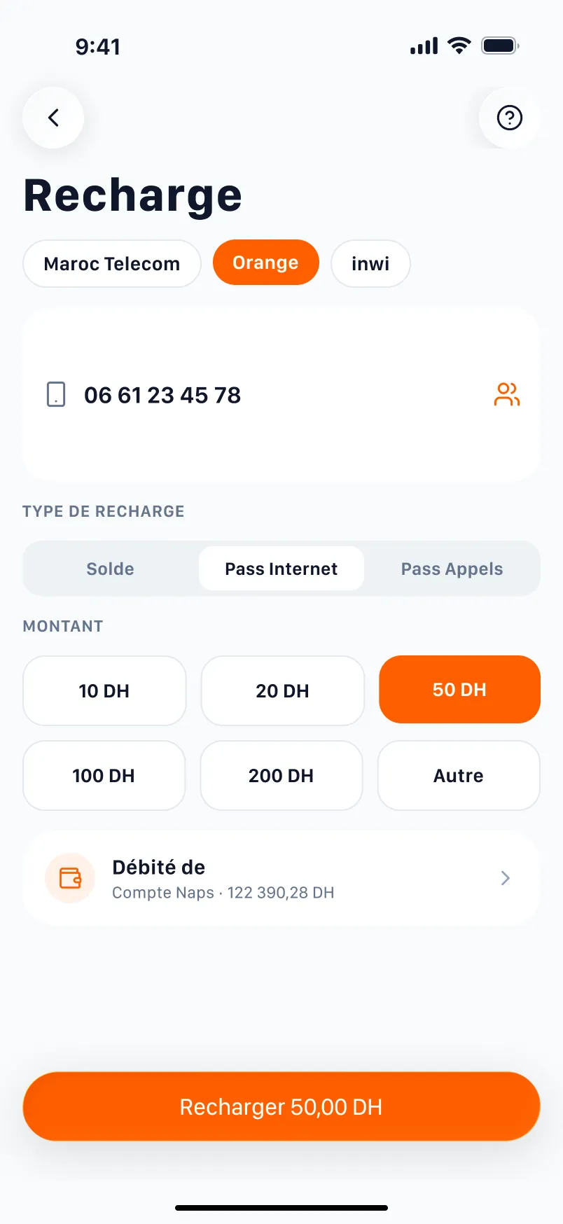
Top-up
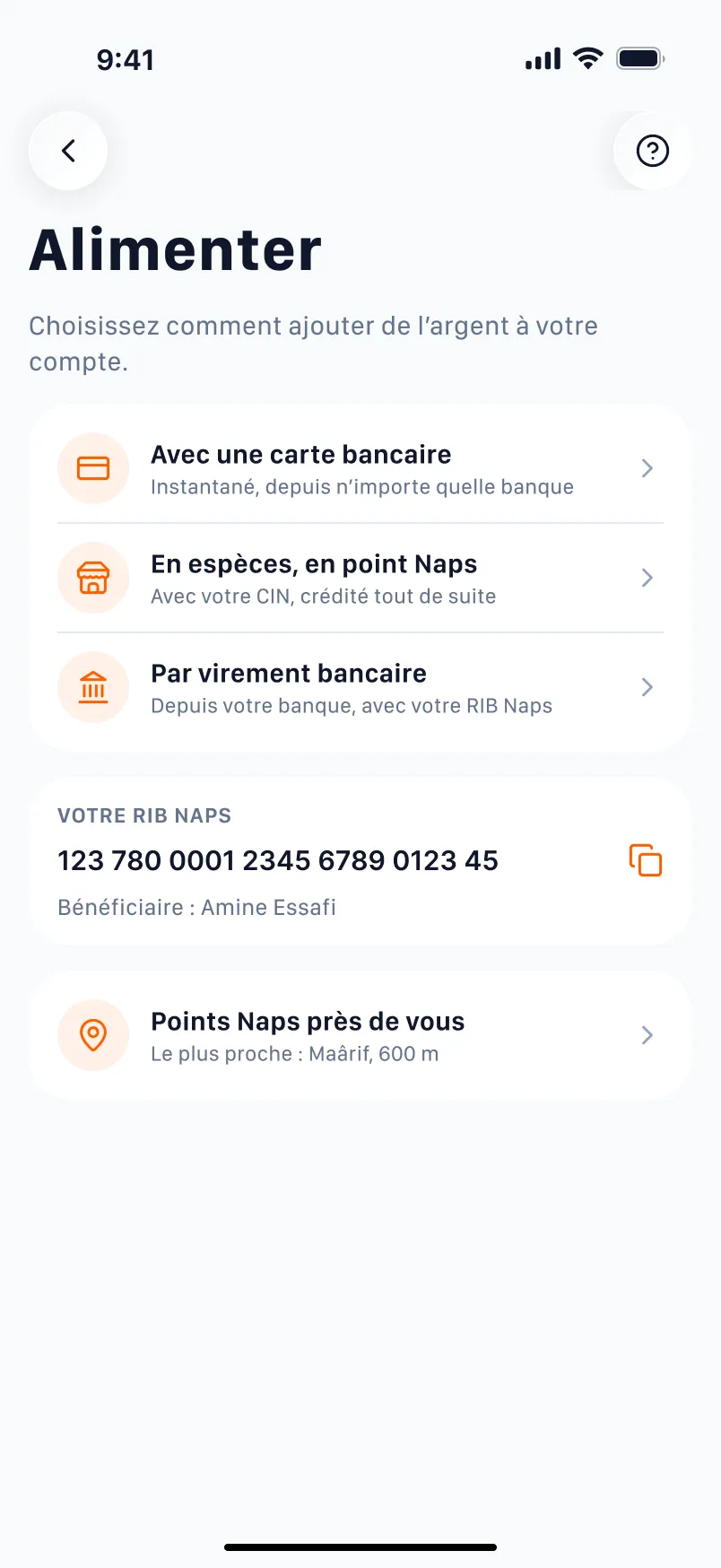
Add money
Analytics
History
Profile
Security
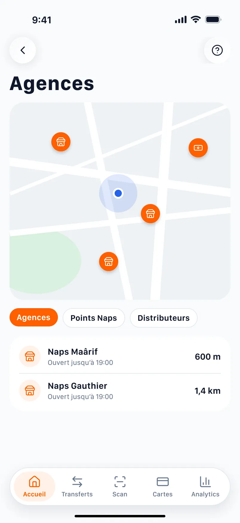
Branches (F6)
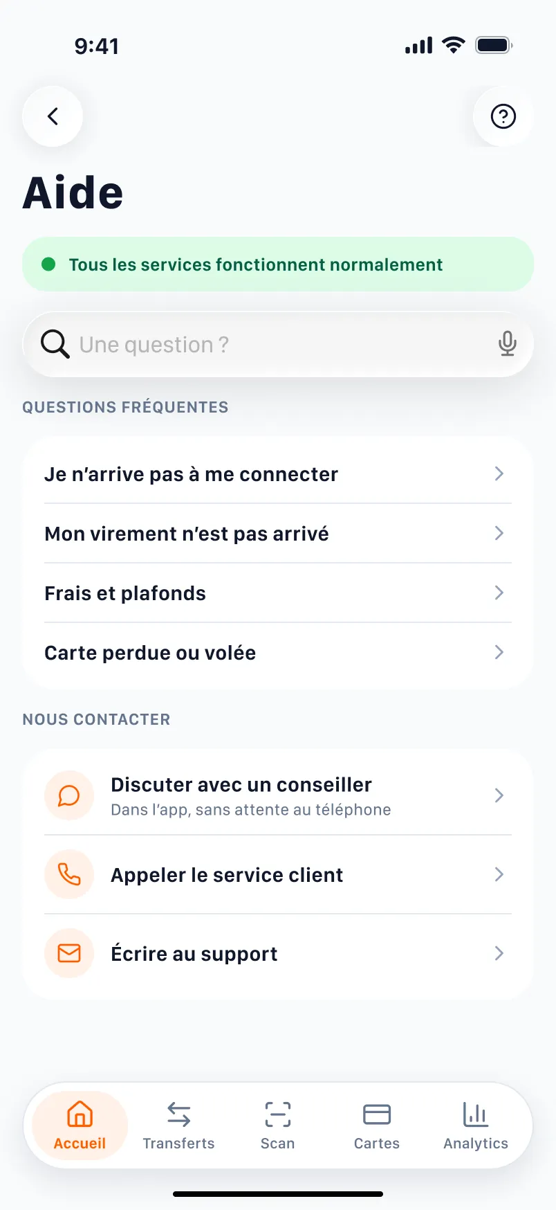
Help (F3)
06 · Validation
UX laws at work
Each visible decision rests on a law, named where it plays.
- Broken
Von Restorff Effect
The one thing that differs is the one thing remembered.
The card number stands out more than the balance.
Today’s home
- Kept
Von Restorff Effect
The one thing that differs is the one thing remembered.
The balance is the only big number on screen.
Home
- Kept
Hick’s Law
More choices, slower decisions: cut and group the options.
Four actions, one navigation system.
Home
- Kept
Fitts’s Law
Big and close targets are reached faster.
Five 44-point targets, within thumb reach.
Tab bar
- Kept
Doherty Threshold
Under 400 ms, the system feels like a conversation.
Confirmation answers without waiting for a code.
Face ID
- Kept
Tesler’s Law
Complexity never disappears, someone carries it: let it be you.
The app remembers people, the user no longer needs a number.
Payees
- Kept
Loss Aversion
Losing hurts about twice as much as winning pleases.
No fee is discovered after paying.
Review
- Kept
Peak-End Rule
People judge the peak and the end, not the average.
The end of a transfer gives proof, not a party.
Success
Expected results
What the redesign should change, and how we would know. None of it has been measured.
| Expected result | Indicator | Indicative target |
|---|---|---|
| Fewer drop-offs at sign-in | Share of sign-ins that succeed first time | 95 % or more (hypothesis) |
| A shorter transfer | Median time from home to receipt, known payee | Under 20 s (hypothesis) |
| Fees understood | Testers who state the total before paying | 6 out of 6 in testing |
| A rating that climbs | Average rating on both stores, six months on | Above 3.5 (hypothesis) |
Indicative targets, to be set with Naps's real data.
The test that would validate the redesign
ParticipantsSix people, two per profile (Yassine, Kenza, Amina), not Naps customers, in moderated 30-minute sessions on the Figma prototype.
01
TaskOpen the app and sign in.
Success criterionSigned in within 10 seconds, without help.
02
TaskSend 450 DH to Aymen, then share the receipt.
Success criterionDone without error, total stated before paying.
03
TaskSet up a 1,200 DH cash pick-up for Mohammed and send him the code.
Success criterionCode shared, validity understood.
04
TaskFreeze the card, then unfreeze it.
Success criterionThree gestures at most, the card's state is clear.
05
TaskPay the water and electricity bill.
Success criterionBill paid, monthly reminder found.
Interview questions
- Tell me about the last time you sent money: to whom, how, and what worried you.
- What would make you trust a bankless app with your salary?
- When an operation has fees, at what moment do you want to know?
- How do you pay your bills today, and what would stop you doing it in an app?
What I take from it
01
Trust is the interface
In a money app a crash reads like a breach: service status, proof and fees matter as much as polish.
02
Start from reviews, not wishes
62 reviews set the priorities better than a feature list: every screen answers a named friction.
03
Two journeys don't make an app
A transfer only makes sense with account opening, sign-in, cards and help around it.
Got a project in mind?
Describe the screen or the workflow that gets in the way: I reply with a first reading of the problem.